Frozzato was built to bring flavour, energy, and consistency into everyday snacking.
Designed for modern households, the brand delivers restaurant-style frozen snacks that are quick to prepare and hard to resist. Frozzato entered a crowded frozen snack market that lacked strong personality and shelf distinction. Our role was to shape a brand that feels premium yet accessible, fun yet trustworthy. From positioning and messaging to visual identity, packaging architecture, and brand guidelines, we developed a complete system designed for impact and scalability. Every decision was guided by clarity, consistency, and long-term growth.
THE CHALLENGE
Frozzato needed to build a distinctive, premium frozen snack brand in a category dominated by generic competition.
The frozen snack market is heavily saturated with white-label and price-driven products, making differentiation extremely difficult at the shelf level.
Most brands in the segment lack a defined personality, resulting in low brand recall and weak emotional connection with consumers.
Shelf visibility was another major challenge. Packaging in the category often feels cluttered or overly functional, failing to create immediate visual impact.
Frozzato needed to appeal to two very different decision-makers at once: children and young adults looking for fun and flavour, and parents seeking quality, hygiene, and reliability.
The brand also had to move beyond being perceived as “just fries” and establish a scalable platform capable of expanding across multiple frozen snack categories.
How we solved
We built a complete, scalable brand system designed to drive recall, shelf impact, and long-term growth.
We developed the full brand positioning framework, including the positioning line, tone of voice, messaging architecture, and tagline to create consistency across all communication.
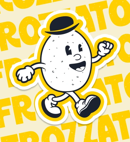
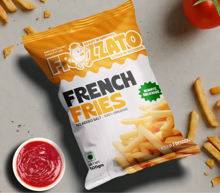
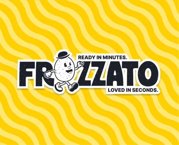
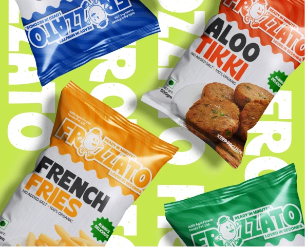
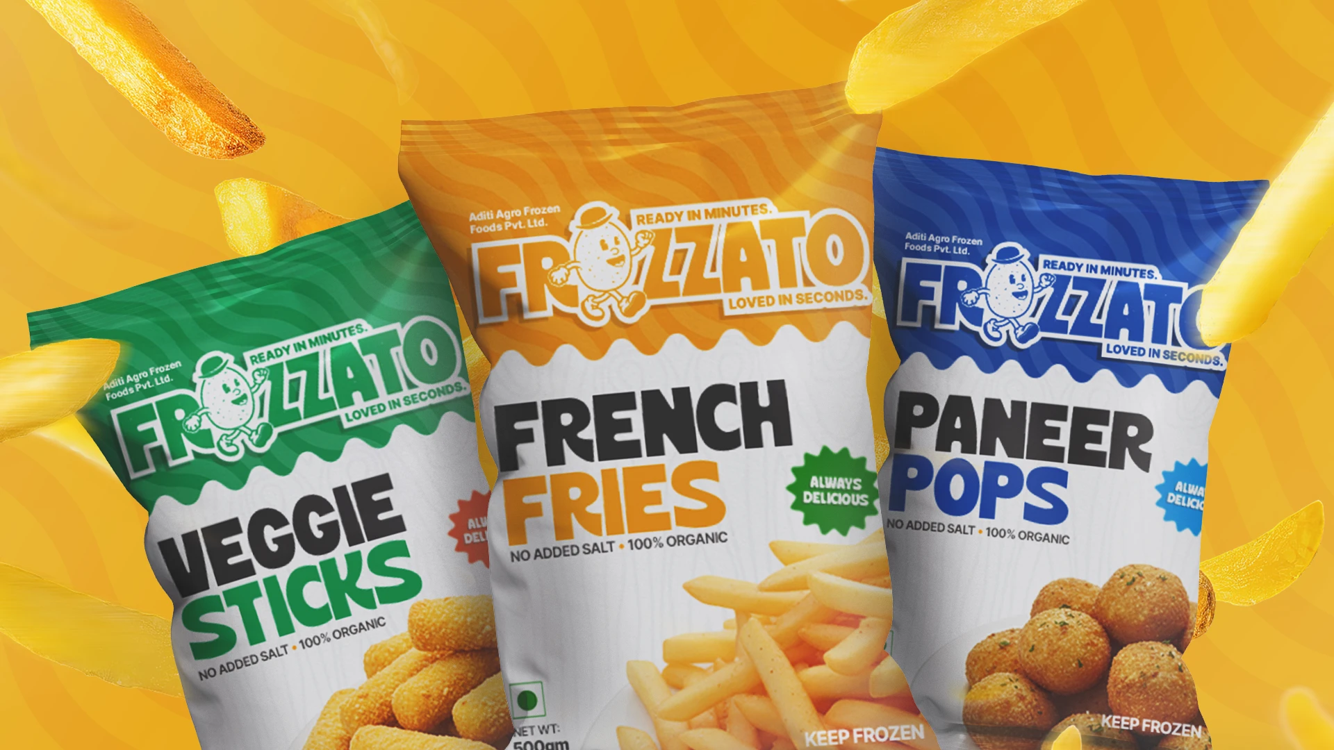
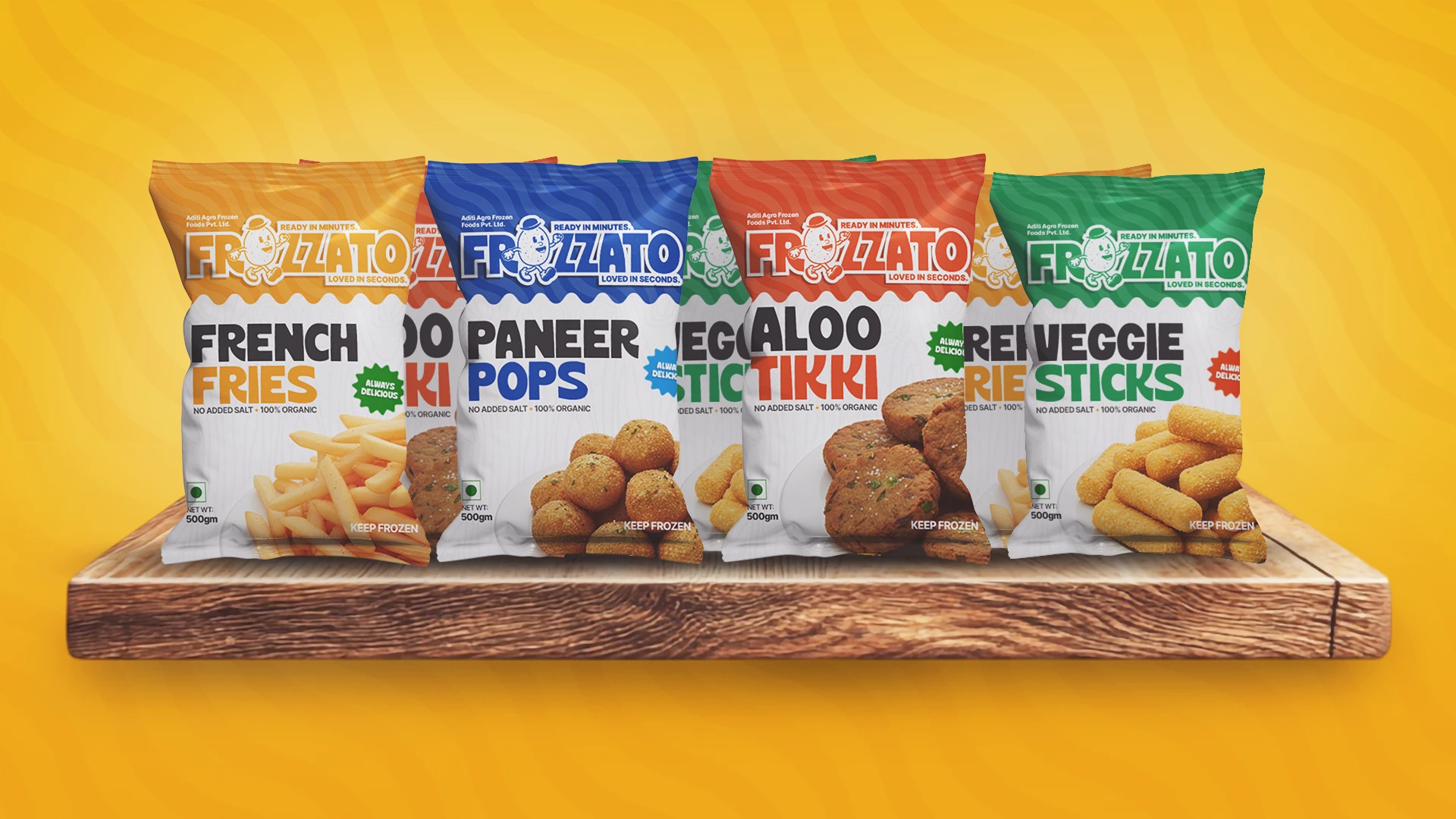
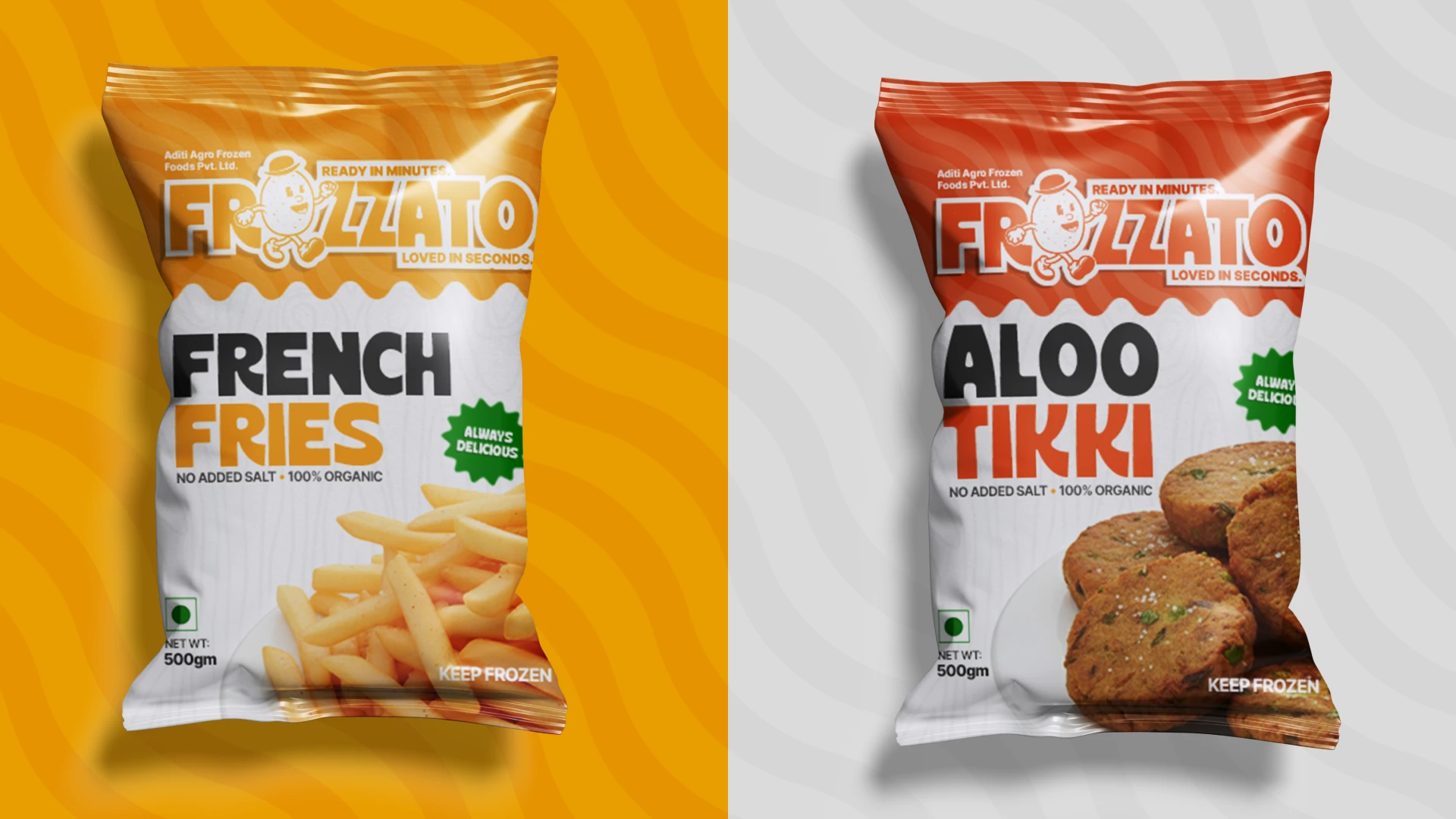
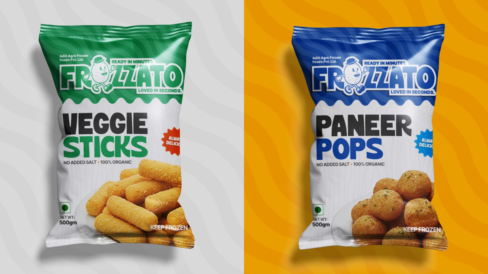
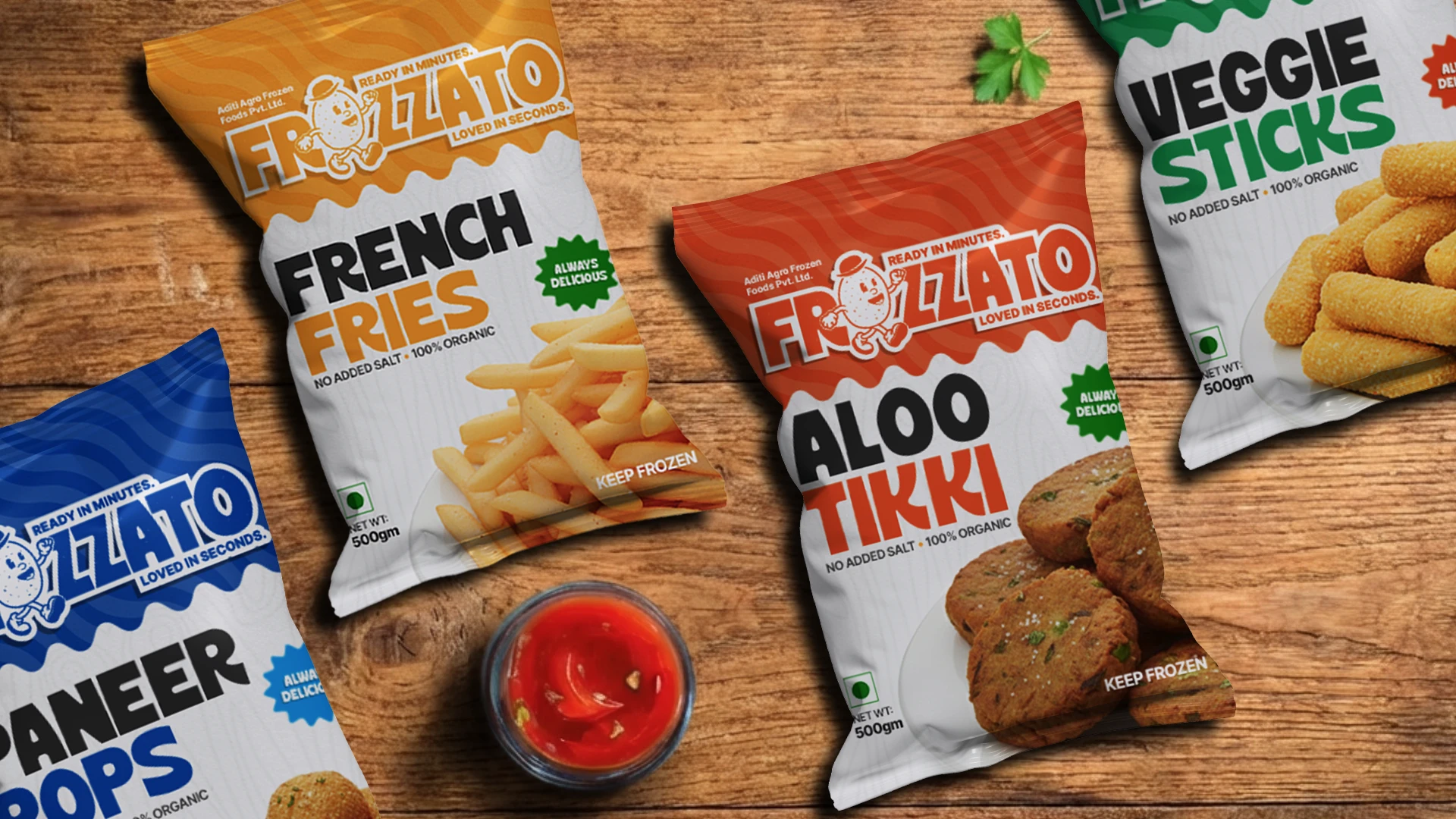
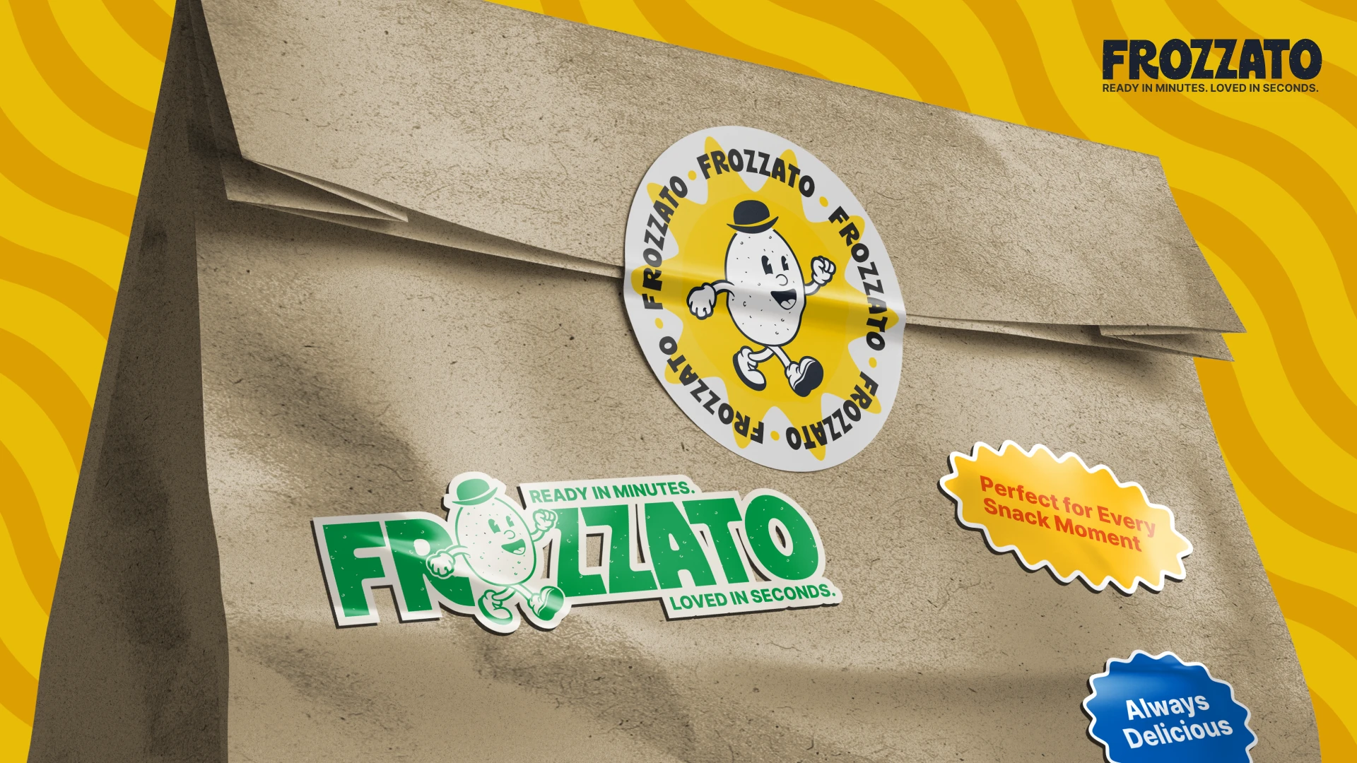
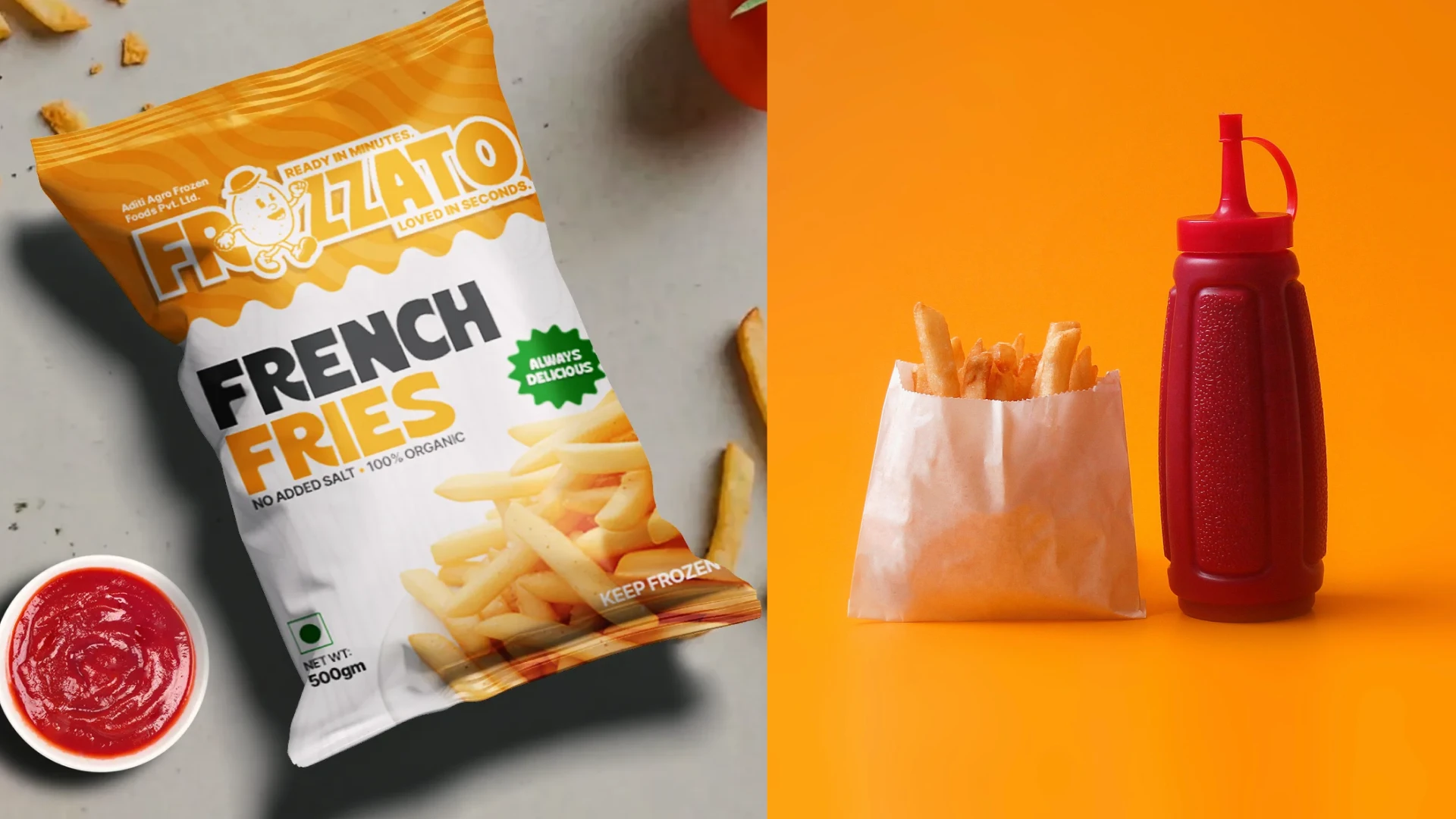
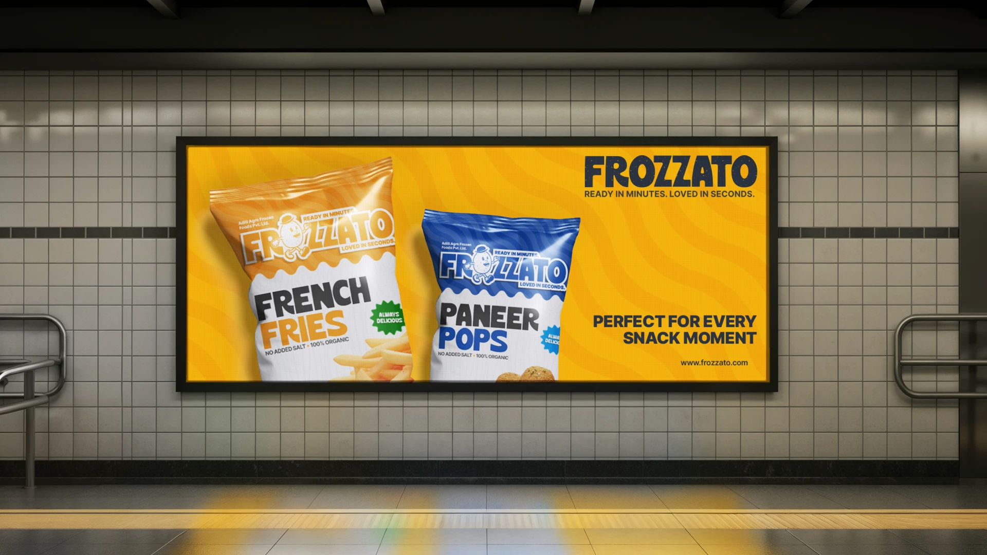
We designed a bold, flavour-led visual identity system with a structured packaging architecture that ensures strong shelf visibility while maintaining clear differentiation across SKUs.
We created a scalable flavour-coded system that allows the range to expand into new product categories without losing consistency or brand recognition.
We developed packaging hierarchy, callout systems, and trust elements that balance youthful energy with reliability and hygiene assurance.
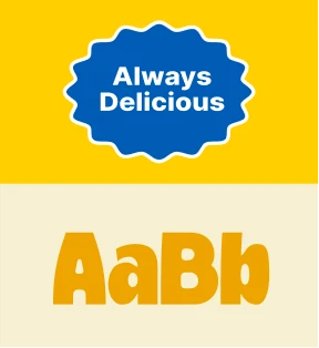
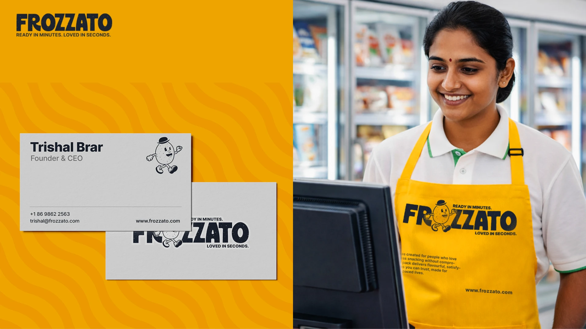
We built comprehensive brand guidelines covering logo usage, typography, colour systems, packaging grid structures, tone of voice, mascot usage, and application rules to ensure long-term consistency.
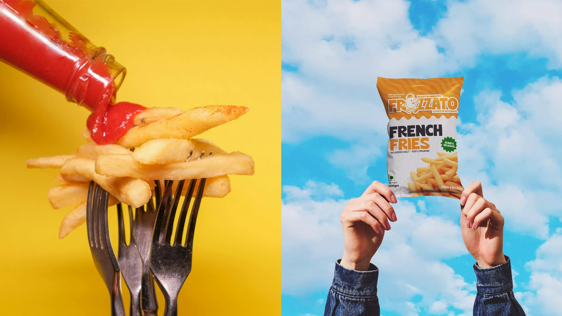
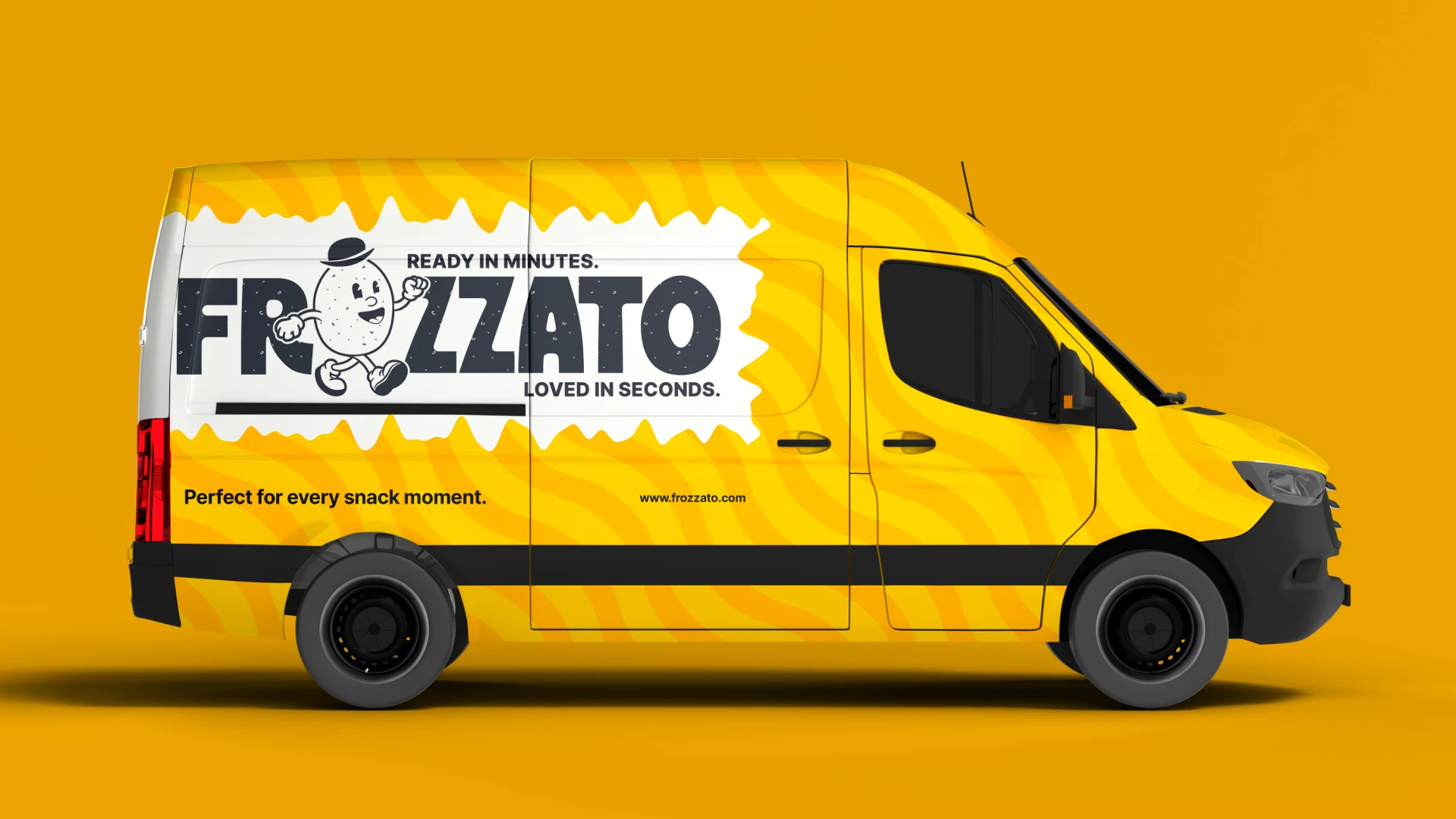
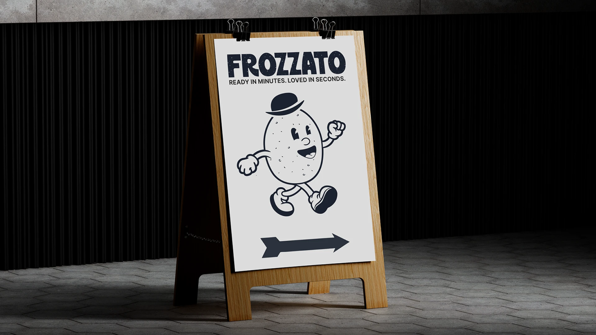
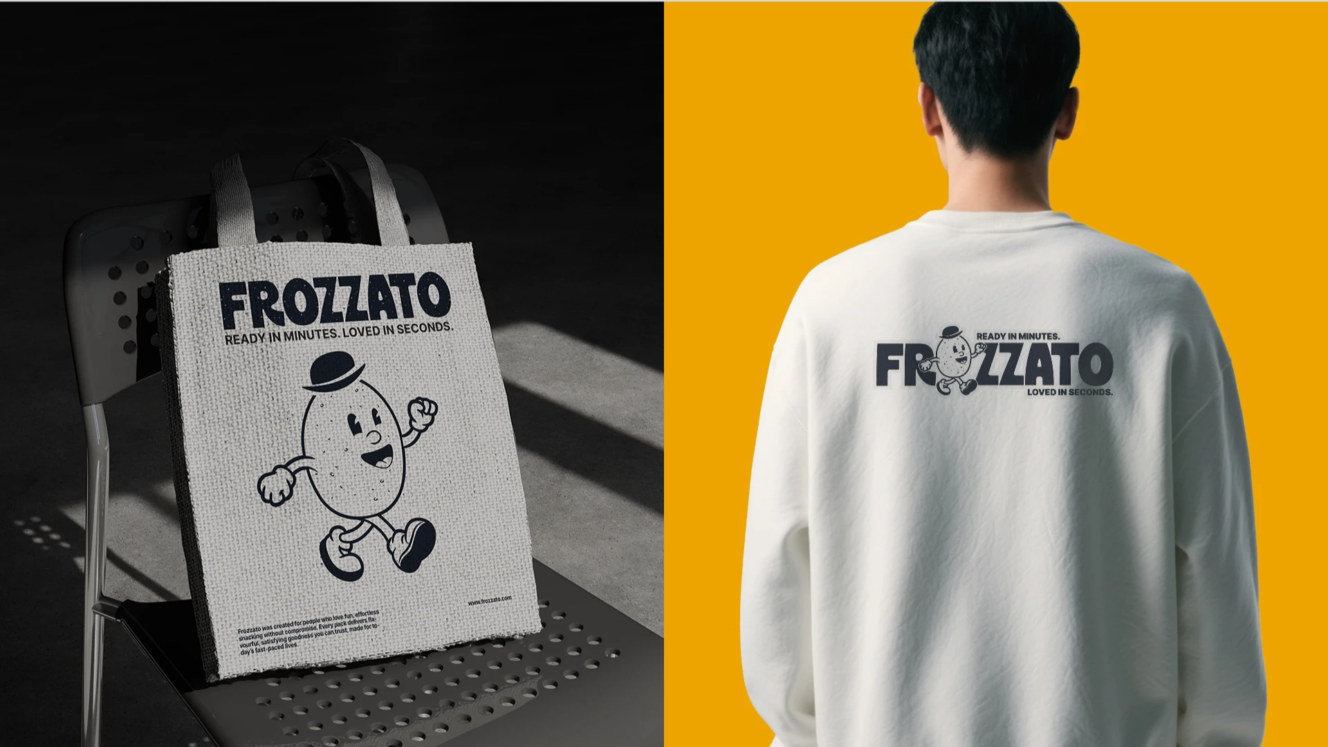
We extended the identity across retail displays, delivery branding, merchandise, and marketing applications to ensure the system works beyond just packaging.
THE Result
Frozzato now stands as a bold, flavour-first frozen snack brand built for long-term growth.
The brand successfully moved beyond generic white-label positioning and established a clear, premium space within the frozen snack category.
Its strong flavour-coded packaging system ensures high shelf visibility and instant recognition across SKUs.
The strategic foundation and comprehensive brand guidelines provide a scalable framework, enabling future product expansion without compromising consistency.
Frozzato is now positioned as a trusted, energetic brand delivering restaurant-quality snacking in minutes.
Trishal Says..
Their understanding of our vision, market positioning, and long-term brand goals was truly impressive. The quality of the deliverables exceeded our expectations.