Frozzato was created to make everyday snacking better; more fun, more flavourful, and more reliable. Bringing restaurant-style snacking into modern homes, the brand delivers frozen favourites ready in minutes and consistent every single time.
Entering a market crowded with generic, white-label products, Frozzato needed a clear personality and a reason to be remembered on the shelf. Our role was to shape a brand that feels youthful and energetic, while still earning trust through quality, hygiene, and consistency. From brand positioning and messaging to visual identity, packaging architecture, and brand guidelines, we built a complete, scalable system designed to stand out today and grow tomorrow. Every decision was guided by one clear promise: restaurant-style snacking at home, without compromise.
THE CHALLENGE
In a sea of generic frozen snacks, Frozzato needed a reason to be remembered.
The frozen snack market was crowded with white-label and price-driven products, making it difficult for new brands to stand out at the shelf.
Most competitors lacked a clear personality, resulting in weak brand recall and low emotional connection with consumers.
Packaging in the category often felt cluttered and overly functional, failing to communicate quality, fun, or trust at first glance.
Frozzato also needed to speak to two very different decision-makers at once; children and young adults seeking fun and flavour, and parents prioritising taste, hygiene, and reliability.
At the same time, the brand had to move beyond being seen as “just fries” and establish itself as a scalable platform for future frozen snack categories, while consistently delivering quality every single time.
Brand Strategy & Execution
We built a brand system made to stand out, sell, and scale.
We started by clearly defining what Frozzato stands for: restaurant-quality snacks at home, ready in minutes, with consistency as a non-negotiable promise. This became the foundation for every creative and strategic decision.
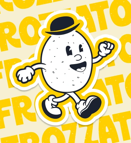
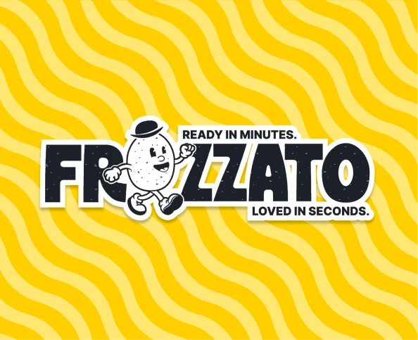
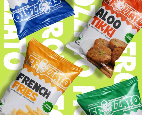
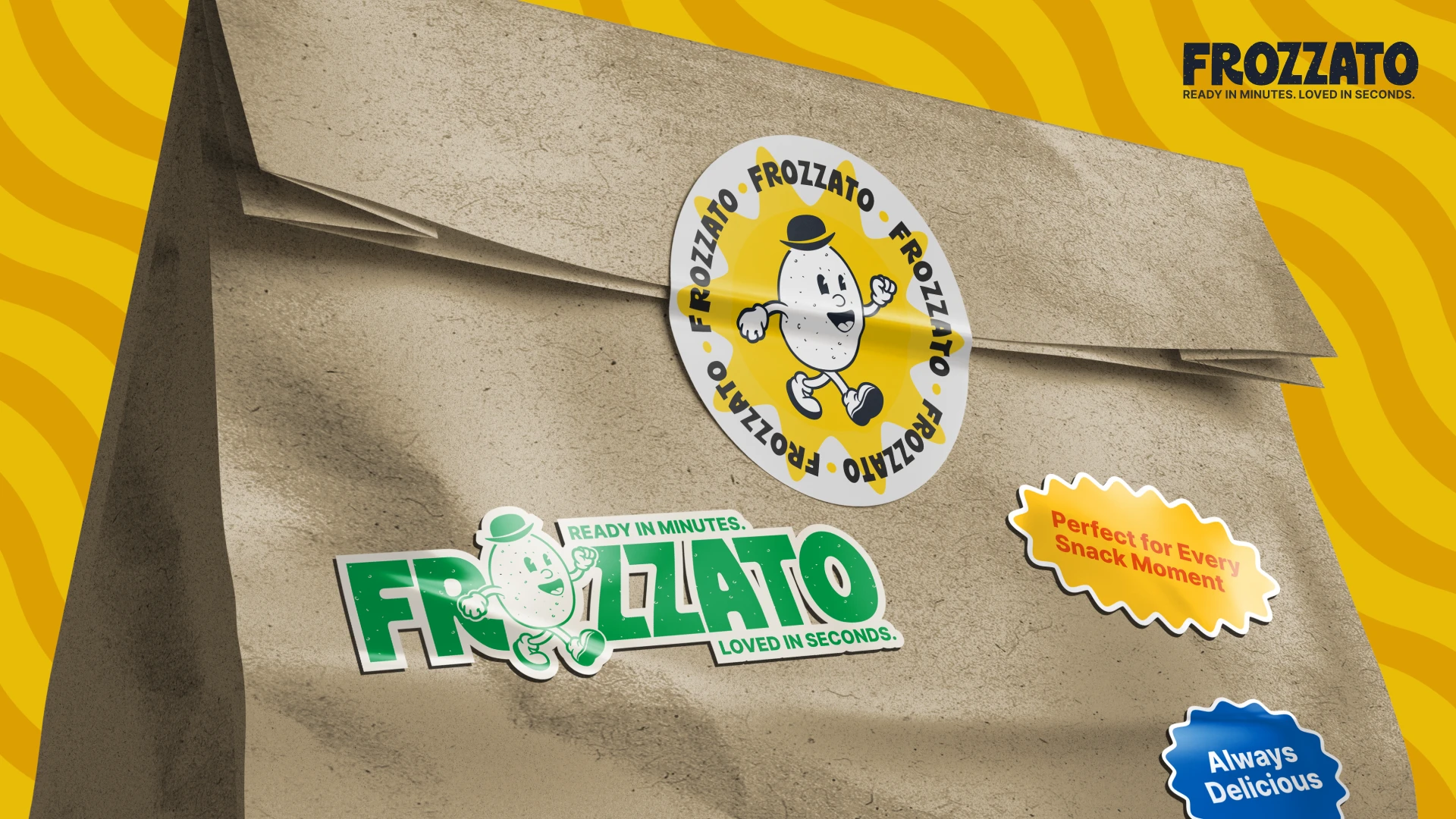
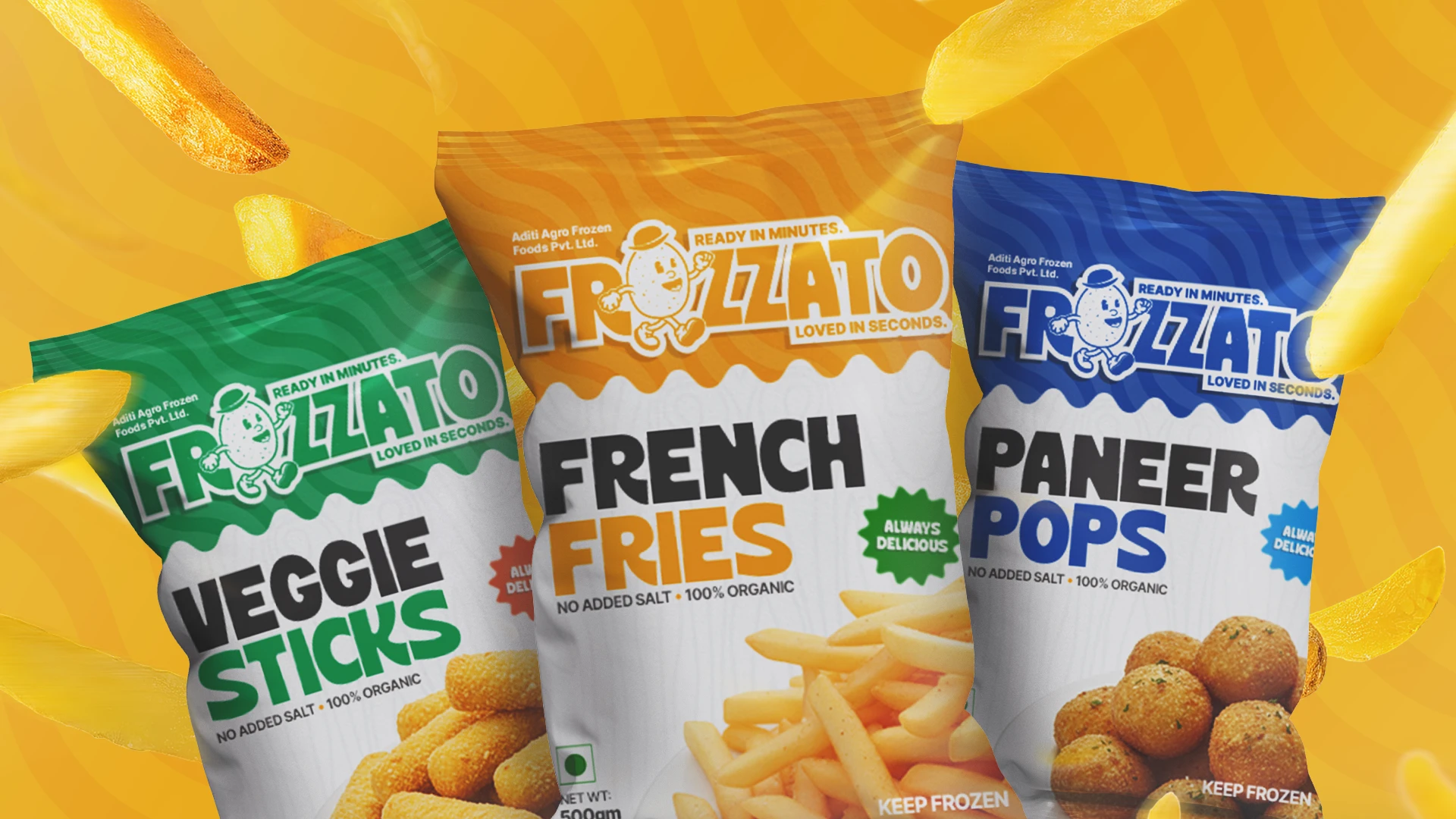
We shaped a fun, youthful, and flavour-forward visual identity that feels energetic on the shelf while still communicating quality and trust to parents and families.
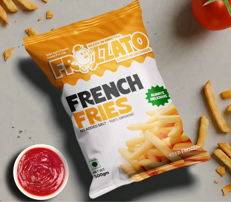
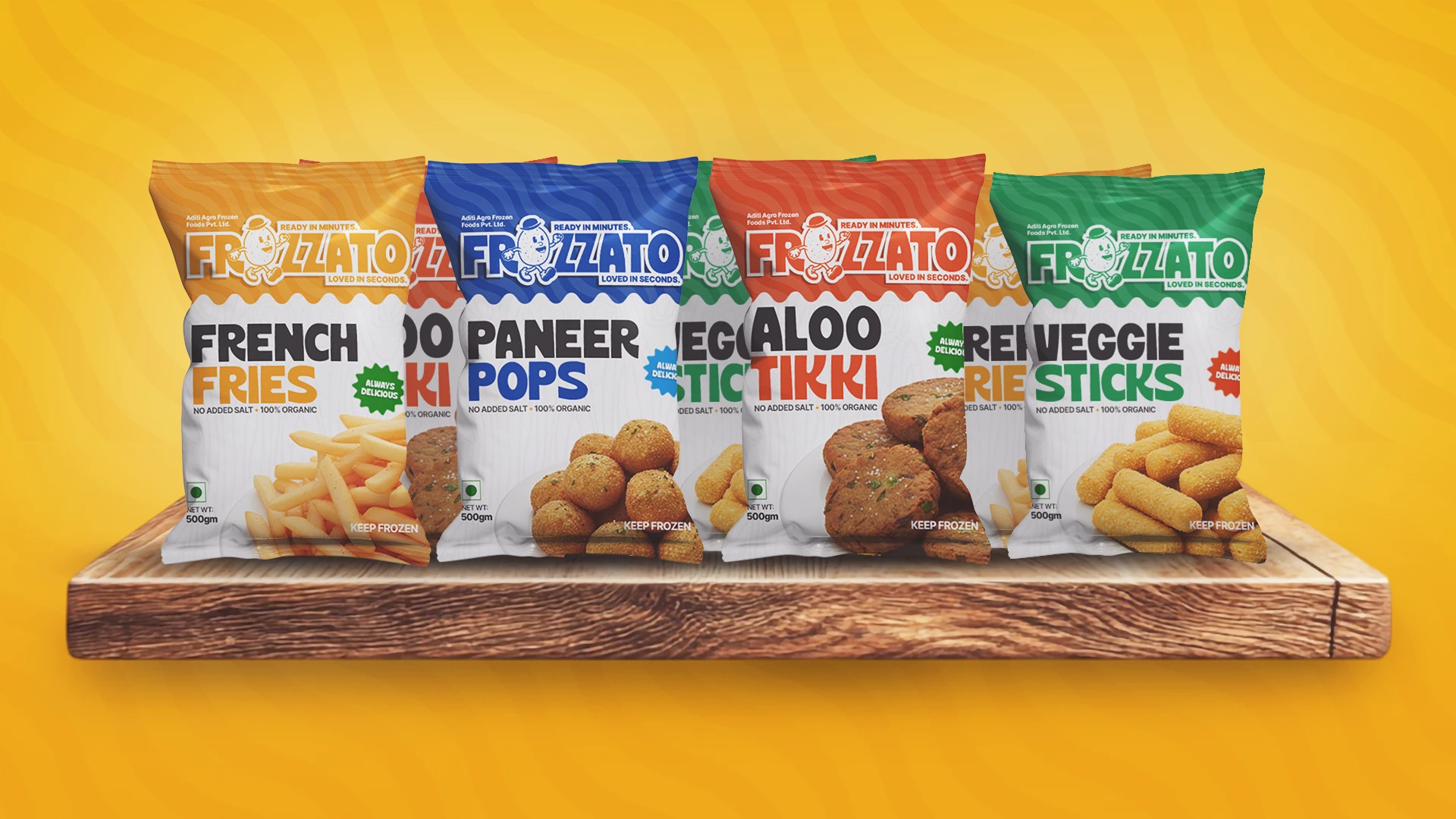
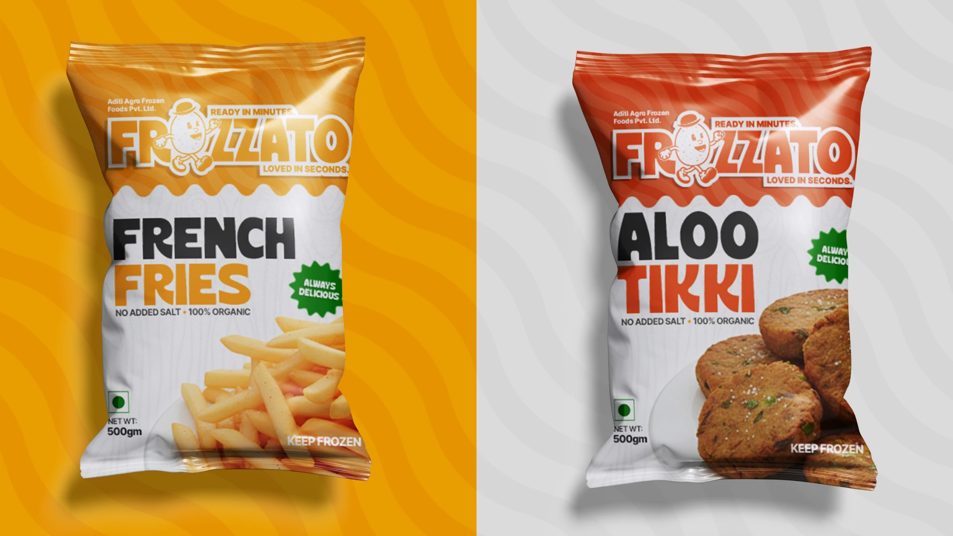
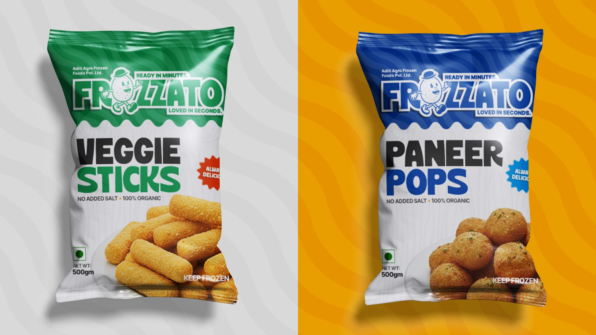
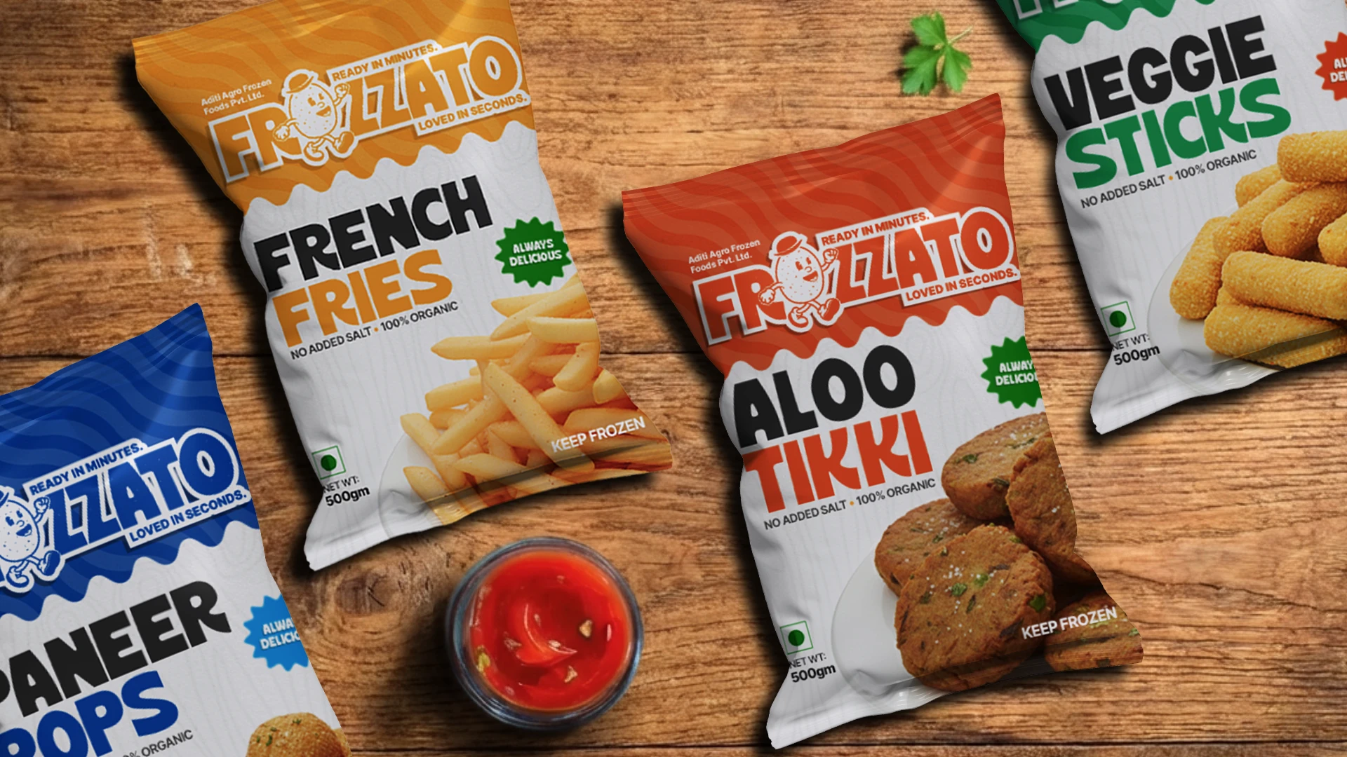
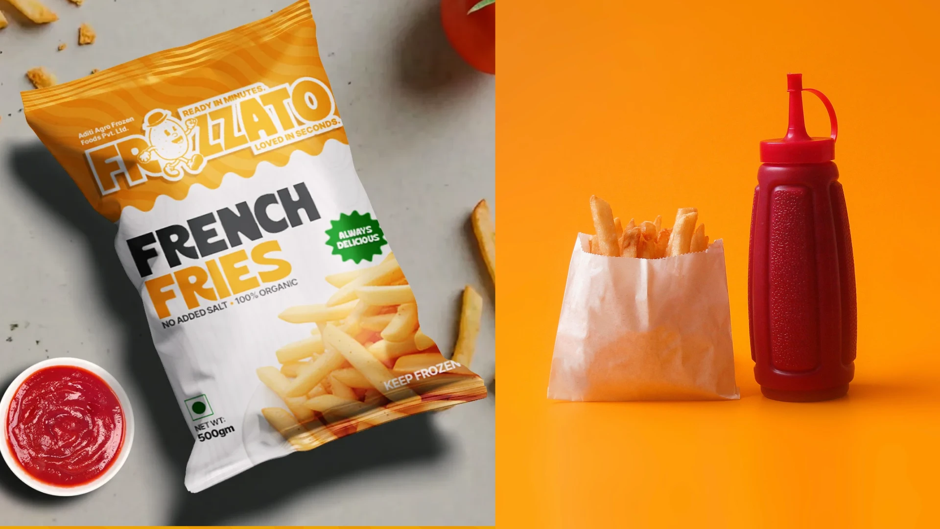
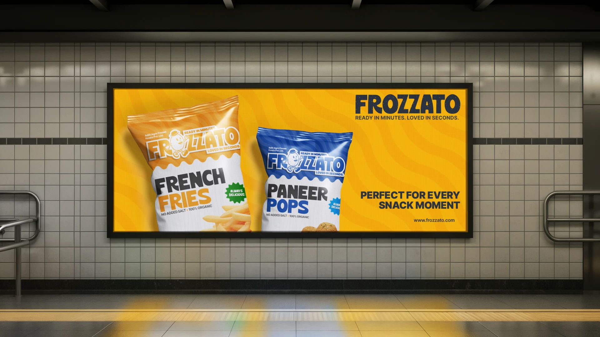
We built a flexible, colour-coded packaging system that makes flavours easy to identify and allows the range to grow without losing recognition or coherence.
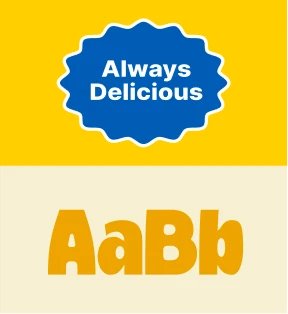
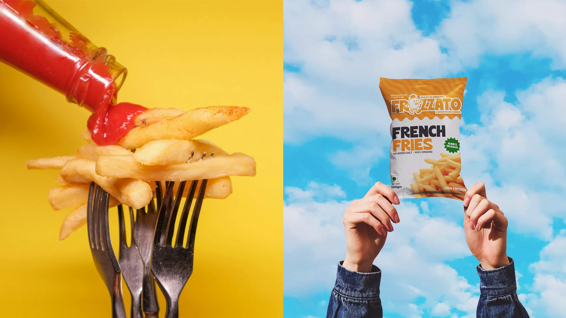
We carefully structured packaging layouts, callouts, and trust markers to highlight crispiness, hygiene, and easy preparation, balancing excitement with reassurance.
We developed detailed brand guidelines to protect the brand’s tone, look, and personality across every touchpoint, ensuring long-term consistency as the business scales.
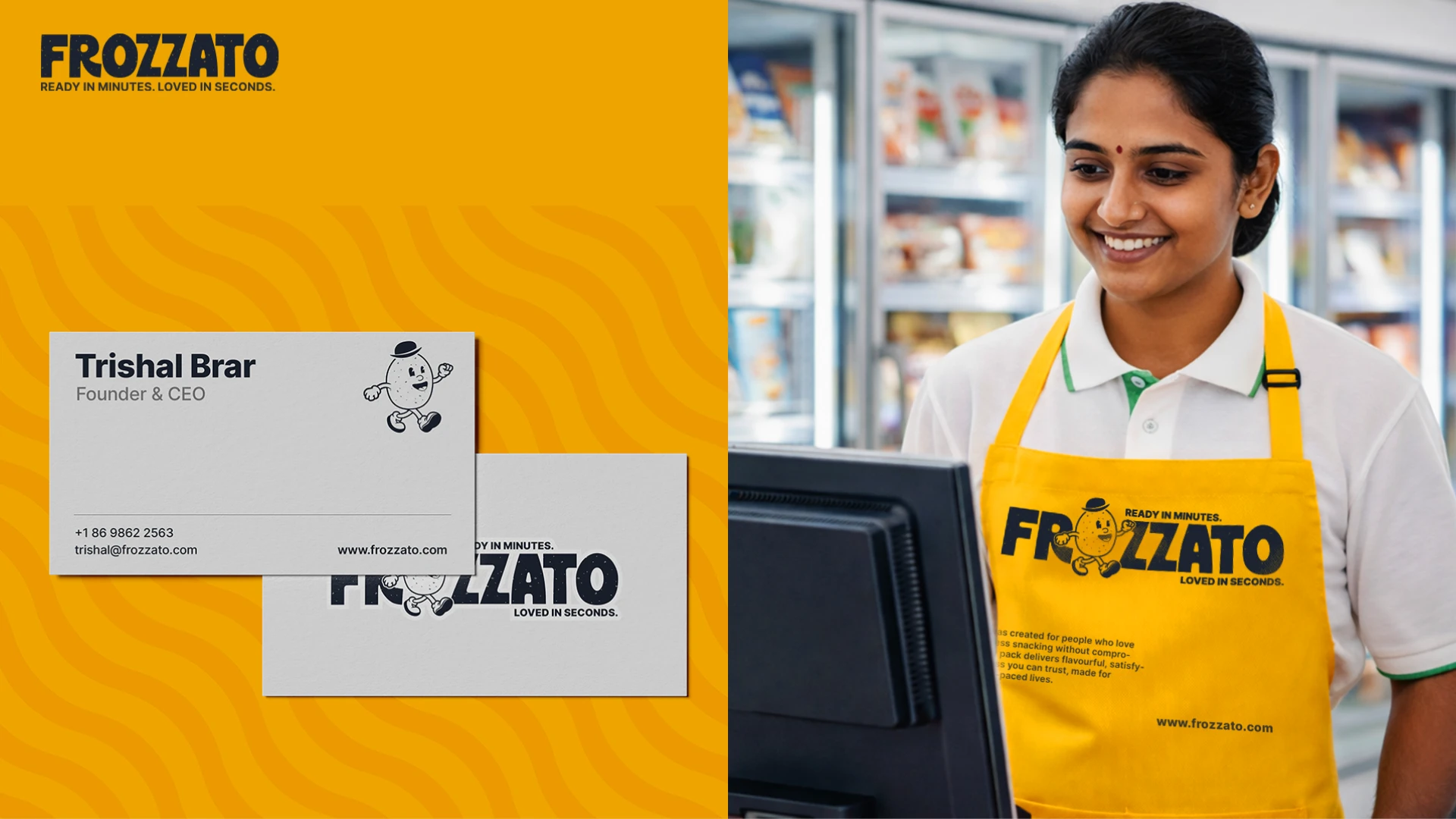
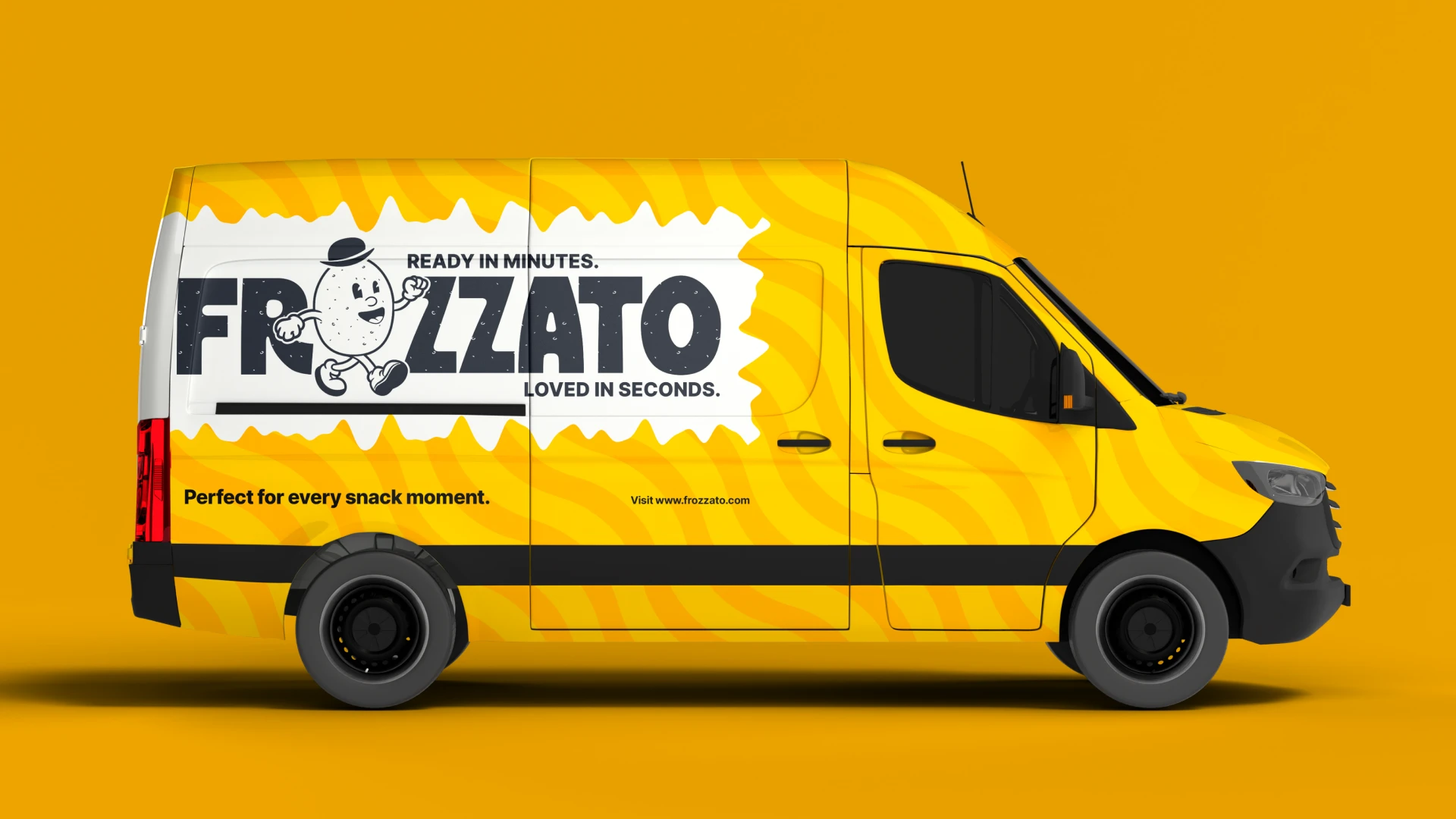
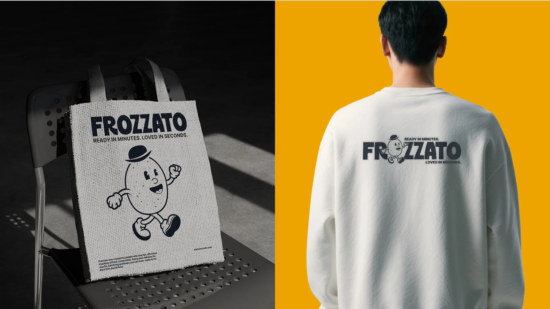
We then extended this identity across retail, delivery, and marketing environments, making sure Frozzato feels familiar, reliable, and exciting wherever customers interact with it.
THE Result
From generic to a brand; people trust and remember.
Frozzato successfully moved away from a generic, white-label perception and established a clear, premium identity within the frozen snack category.
The flavour-led packaging system improved shelf visibility and made the brand easy to recognise across products and variants.
With a strong strategic foundation and clear brand guidelines in place, Frozzato is now set up to expand into new frozen snack categories without losing consistency or trust.
Today, Frozzato stands as a fun, energetic, and reliable brand, delivering restaurant-quality snacking at home, ready in minutes, and consistent every time.
Trishal Says..
Their understanding of our vision, market positioning, and long-term brand goals was truly impressive. The quality of the deliverables exceeded our expectations.
Trishal Brar
Owner — Aditi Agro Frozen Foods
NEXT PROJECT • NEXT PROJECT • NEXT PROJECT •NEXT PROJECT • NEXT PROJECT • NEXT PROJECT •NEXT PROJECT • NEXT PROJECT • NEXT PROJECT •
NEXT PROJECT • NEXT PROJECT • NEXT PROJECT •NEXT PROJECT • NEXT PROJECT • NEXT PROJECT •NEXT PROJECT • NEXT PROJECT • NEXT PROJECT •
PAWNDERR
NEXT PROJECT • NEXT PROJECT • NEXT PROJECT •NEXT PROJECT • NEXT PROJECT • NEXT PROJECT •NEXT PROJECT • NEXT PROJECT • NEXT PROJECT •
NEXT PROJECT • NEXT PROJECT • NEXT PROJECT •NEXT PROJECT • NEXT PROJECT • NEXT PROJECT •NEXT PROJECT • NEXT PROJECT • NEXT PROJECT •