Redefining maternal care through comfort, confidence, and quiet luxury
The ButterCup was built on a simple but powerful idea; motherhood deserves care that feels as gentle as it is reliable. Positioned as a premium maternal care brand, it brings together comfort, functionality, and emotional reassurance in a way that feels considered, not clinical.
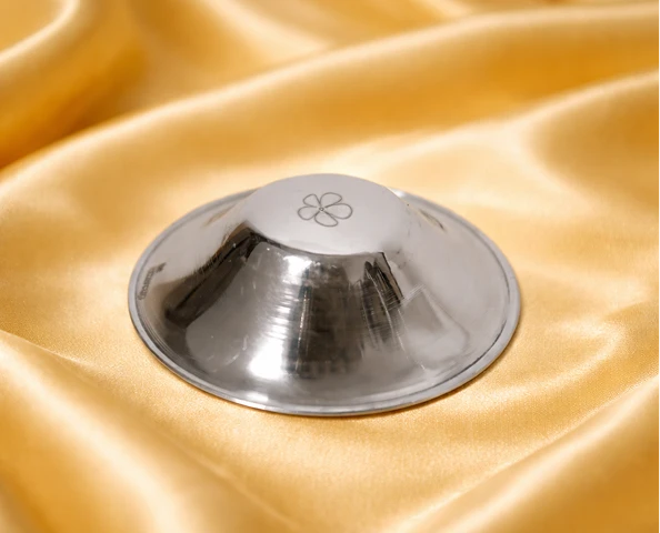
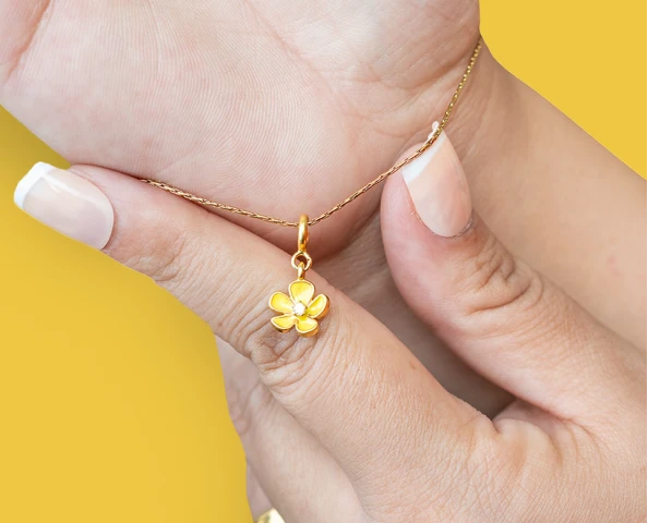
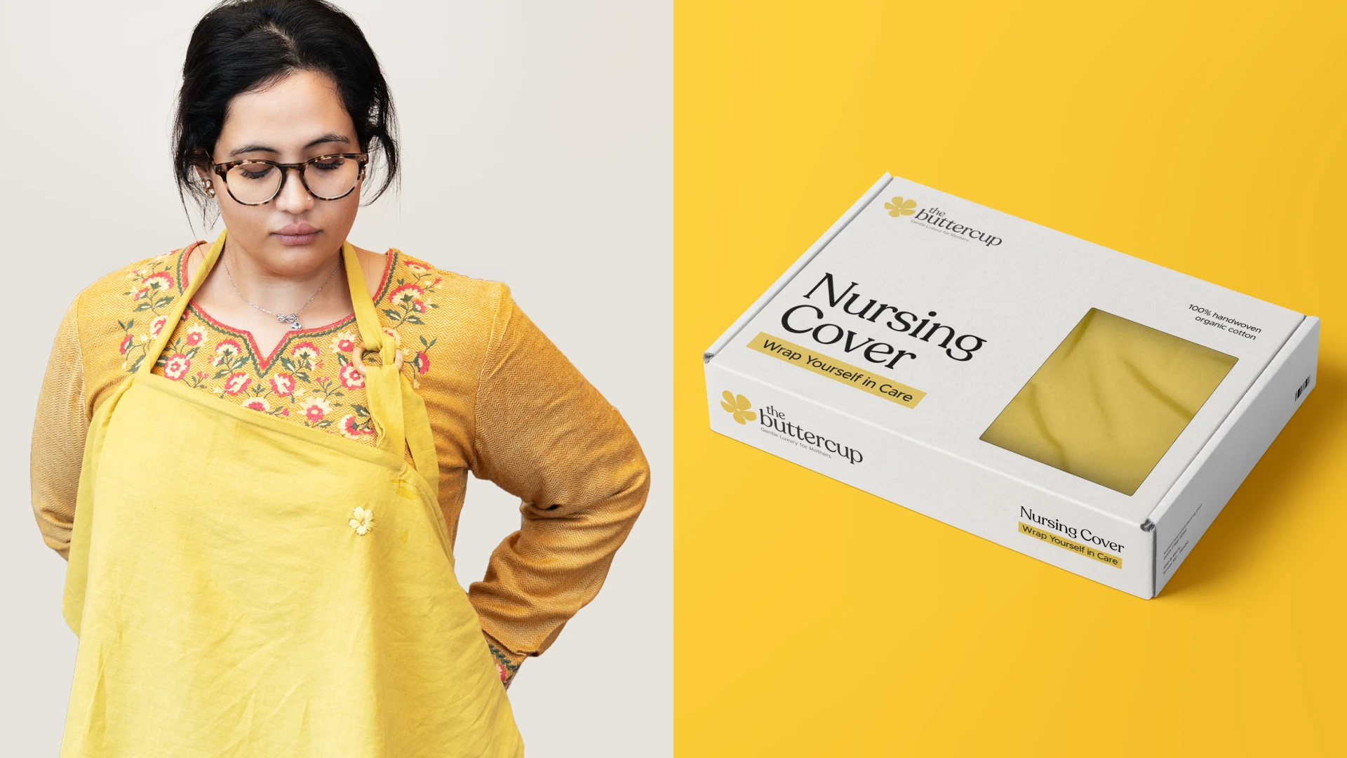
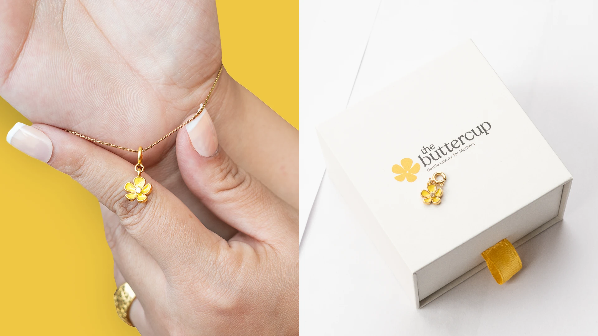
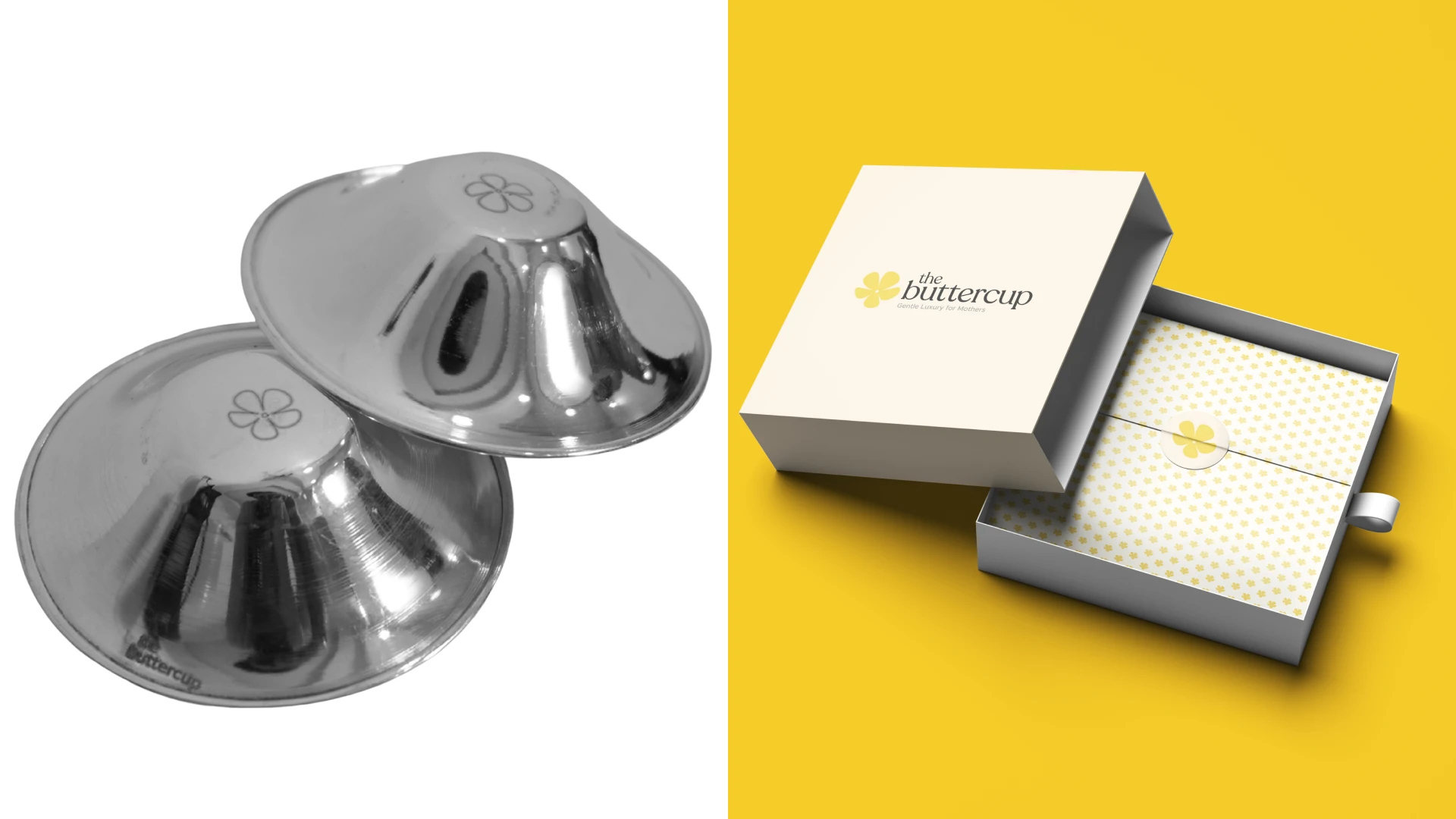
Starting with three essentials; a nipple shield, nursing covers, and a charm, the brand needed more than just design. It needed a point of view. Our role was to shape The ButterCup from the ground up, building its strategy, voice, identity, and packaging into a cohesive system that feels soft, refined, and deeply trustworthy.
THE CHALLENGE
Creating emotional connection in a category driven by function
Maternal care as a category often leans to extremes; either overly clinical or overly decorative, leaving little room for balance.
Products that are deeply personal are often treated as purely functional, missing the emotional context that defines motherhood.
The ButterCup needed to build trust without feeling medical, and offer comfort without losing credibility.
The brand had to feel premium yet accessible, gentle yet confident; a balance that is easy to aim for but difficult to execute.
With only three initial products, it also required a strong foundation that could support future expansion into a broader maternal lifestyle space.
Above all, it had to communicate safety, hygiene, and reliability in a way that feels reassuring, not overwhelming.
Brand Strategy & Execution
Designed to feel as gentle as the care it offers
We began by defining a clear brand position rooted in emotional care, softness, and quiet confidence; shaping The ButterCup as a presence mothers can trust, not just a product they use.
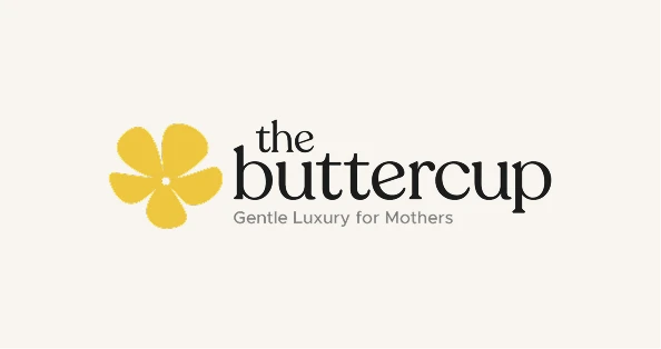
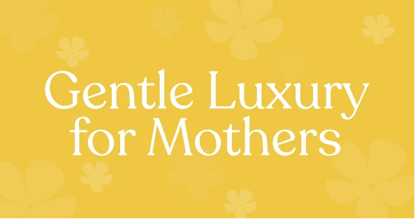
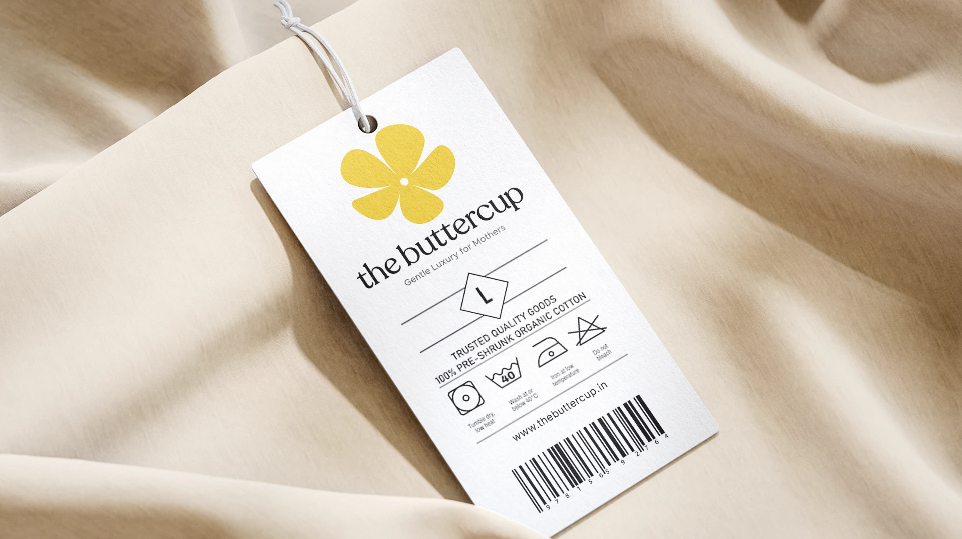
The tagline “Gentle Luxury for Mothers” became the anchor, setting the tone for everything that followed.
We developed a messaging system that balances warmth with clarity, ensuring the brand speaks with empathy while still communicating product value effectively.
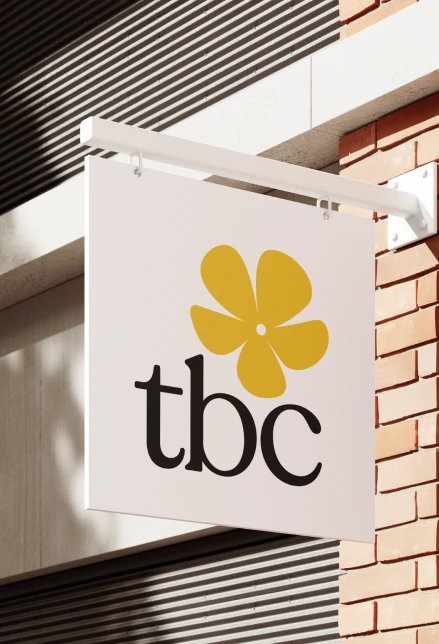
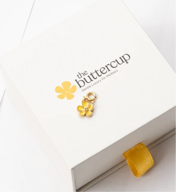
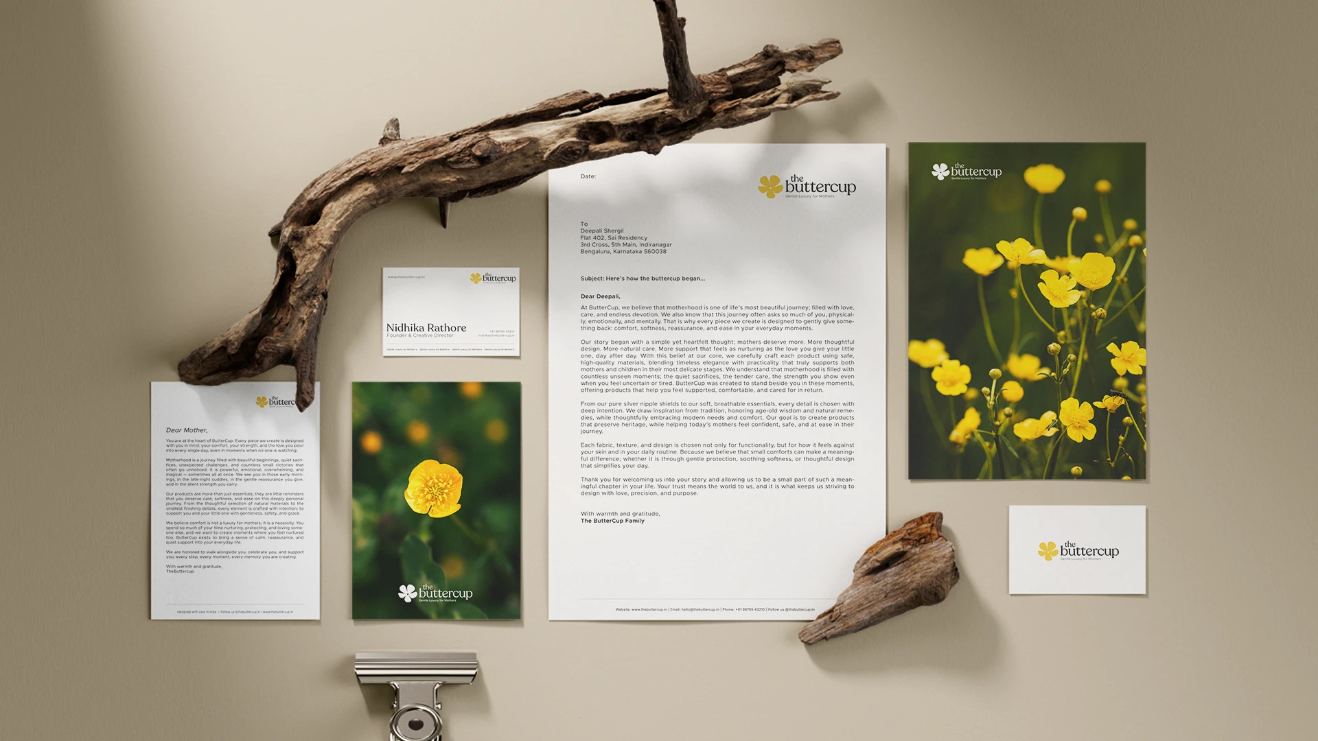
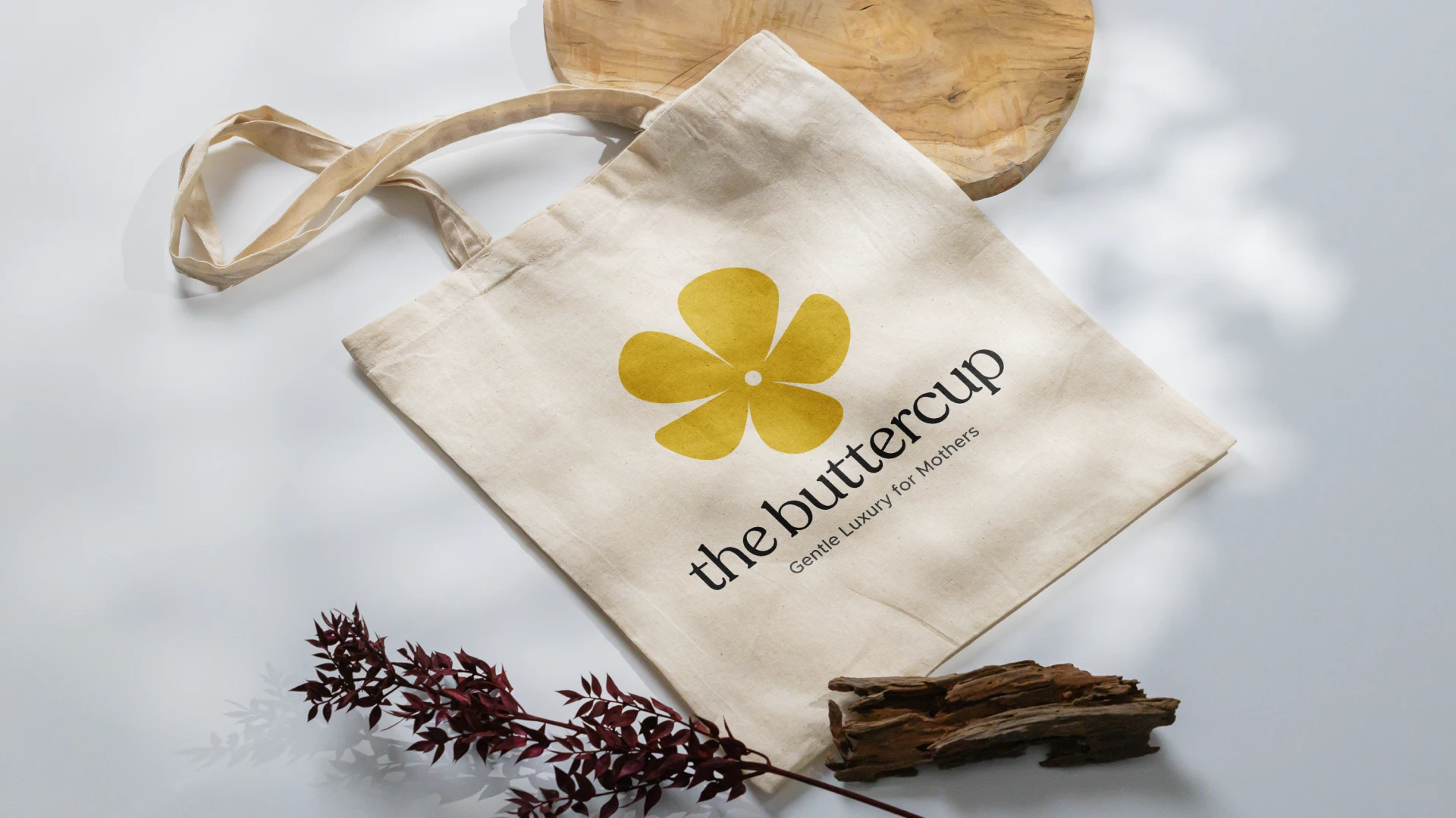
The visual identity was crafted with restraint and intention; soft tones, minimal forms, and refined details that reflect elegance without excess.
Packaging was designed as a cohesive system across all three products, maintaining consistency while allowing each to hold its own identity.
Comprehensive brand guidelines were created to ensure consistency across every touchpoint; from typography and color to imagery and tone of voice.
Every element was built with scalability in mind, allowing the brand to grow into a larger maternal care ecosystem without losing its essence.
THE Result
A maternal care brand that feels as reassuring as it looks
The ButterCup now stands as a distinct presence in the maternal care space, one that brings emotional warmth into a category often defined by function.
Its identity balances softness with credibility, creating a brand that feels both comforting and reliable.
The packaging system delivers clarity and elegance, helping the products feel considered, premium, and easy to trust.
With a strong strategic foundation in place, the brand is built to expand while maintaining consistency and recognition.
Today, The ButterCup represents a new kind of maternal care; one that offers comfort with confidence, and luxury in its most gentle, thoughtful form.
Nidhika Says..
What a fantastic team. I don’t know another company that is such a value driven combination of professionalism as well as personal commitment. They were able to bring my vision to life perfectly and have great taste/asthetic palettes.
Nidhika Singh Rathore
Founder — The ButterCup, CEO at Castle & Moat
NEXT PROJECT • NEXT PROJECT • NEXT PROJECT •NEXT PROJECT • NEXT PROJECT • NEXT PROJECT •NEXT PROJECT • NEXT PROJECT • NEXT PROJECT •
NEXT PROJECT • NEXT PROJECT • NEXT PROJECT •NEXT PROJECT • NEXT PROJECT • NEXT PROJECT •NEXT PROJECT • NEXT PROJECT • NEXT PROJECT •
FROZZATO
NEXT PROJECT • NEXT PROJECT • NEXT PROJECT •NEXT PROJECT • NEXT PROJECT • NEXT PROJECT •NEXT PROJECT • NEXT PROJECT • NEXT PROJECT •
NEXT PROJECT • NEXT PROJECT • NEXT PROJECT •NEXT PROJECT • NEXT PROJECT • NEXT PROJECT •NEXT PROJECT • NEXT PROJECT • NEXT PROJECT •