The Strategic Power of Handwriting Fonts in Brand Communication
1. Executive Summary: The Human Touch in Typography
This report explores the strategic influence of handwriting fonts in branding and marketing. In an increasingly digital and automated environment, these typefaces present a distinct opportunity to infuse authenticity, warmth, and a personal connection into brand communications. The analysis will delve into their profound psychological impact, trace their rich historical development, categorize their diverse styles, highlight their most effective applications through illustrative case studies, address common implementation challenges with practical solutions, and forecast their future relevance within evolving design trends. The overarching objective is to equip brands with the knowledge necessary to effectively leverage handwriting fonts for cultivating deeper customer relationships and strengthening market presence.
2. The Enduring Psychology of Handwriting Fonts
Typography extends beyond mere aesthetic preference; it functions as a potent non-verbal communication tool, subtly influencing how individuals perceive and engage with brands and products. Handwriting fonts, in particular, possess a unique capacity to forge emotional connections and convey a sense of authenticity.
Subconscious Impact of Typography
Fonts are powerful symbolic cues that shape consumer interpretation and judgment of products and brands. They communicate both explicit information, such as product names, and implicit meanings that align with product characteristics. This processing occurs almost instantaneously, often within milliseconds, shaping initial impressions and emotional responses even before the content is consciously read. A thoughtfully chosen font enhances a brand’s perceived professionalism, while an inappropriate selection can lead to confusion or erode trust. The visual style of a typeface can trigger an immediate emotional response, influencing how a message is received before any words are processed.
Fostering Authenticity and Connection
Handwriting fonts inherently suggest a human presence behind the message, effectively cutting through the pervasive digital noise and preventing brands from appearing overly robotic. This human element is perceived as genuine care, meticulous attention, and sincere appreciation for the audience. These fonts evoke feelings of warmth, creativity, and nostalgia, contributing to a more approachable and intimate brand perception. The fluid strokes, subtle irregularities, and variations in letter sizes within handwriting fonts closely replicate genuine penmanship, thereby enhancing perceived sincerity and authenticity.
Influence on Consumer Behavior
Empirical studies have demonstrated that handwritten typefaces positively influence consumer attitudes and purchase intentions when compared to machine-typed fonts. This influence is not merely direct; it is mediated by two sequential mechanisms: perceived congruence and perceived sincerity. Perceived congruence arises when handwritten fonts visually align with a product’s inherent identity, such as the “natural” feel of organic food, which contrasts with the mechanical association of industrial production. This visual harmony improves the fluency of information processing and bolsters credibility. Furthermore, the integration of first-person narratives can amplify these positive effects, drawing consumers deeper into the product’s story and intensifying the perceived congruence and sincerity of the handwritten fonts. These combined cues lead to more favorable consumer-product relationships, positive advertising attitudes, and higher purchase intentions.
A significant observation emerges regarding the application of handwritten fonts: a strategic alignment of font personality with product type can yield substantial benefits. Handwritten fonts are particularly effective for “hedonic” products, those purchased for pleasure, experience, or emotional gratification, such as decorative candles, fashion items, or gourmet foods. This is because these fonts impart a sense of human presence, fostering an emotional attachment that enhances the appeal of such products. This effect humanizes the product, making it more desirable. Conversely, for “functional” or utilitarian products (e.g., home repair services, accounting, building materials), machine-written fonts are generally more effective as they convey messages of sturdiness, professionalism, and technical competence. This indicates that the choice of a handwritten font is not a universal solution but a nuanced decision, contingent on the core value proposition of the product or service. Brands can achieve a measurable improvement in conversions and customer satisfaction by understanding and applying this distinction.
Comparison with Other Font Categories
To fully appreciate the role of handwriting fonts, it is beneficial to consider them within the broader landscape of typeface categories.
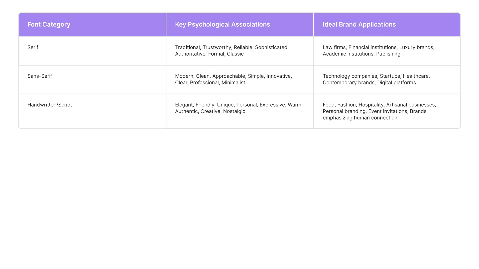
- Serif Fonts: Characterized by small lines or “feet” at the end of strokes, serif fonts convey a sense of tradition, reliability, sophistication, authority, and trustworthiness. They are often the preferred choice for law firms, financial institutions, luxury brands, and academic institutions seeking to project heritage and credibility.
- Sans-Serif Fonts: Lacking the decorative strokes of serifs, these fonts present a clean, modern appearance. They communicate simplicity, innovation, approachability, clarity, and professionalism. Sans-serif fonts are widely popular among technology companies, startups, and healthcare providers aiming for a forward-thinking and accessible image.
- Handwritten/Script Fonts: These typefaces mimic cursive handwriting or calligraphy, inherently conveying elegance, romance, warmth, authenticity, creativity, and a personal touch. They are perceived as unique and friendly, offering a distinct personality to a brand.
The comparison of serif, sans-serif, and handwritten fonts reveals a continuum in how brands cultivate trust. Serif fonts primarily build a sense of traditional trust and authority, rooted in history and formality. Sans-serif fonts establish modern trust through clarity, efficiency, and a contemporary feel. Handwritten fonts, on the other hand, foster emotional trust by conveying authenticity, intimacy, and a personal connection. This suggests that “trust” itself is not a monolithic concept but a multifaceted construct. The specific type of trust a brand aims to cultivate should directly inform its primary font choice. This moves beyond simple categorization to a more profound understanding of strategic intent. Marketers must therefore identify the core emotional and rational pillars of their brand’s trust proposition, whether it is gravitas, transparency, or relatability, as this will dictate not only whether to use a handwritten font but also how it integrates into the broader typographic system to reinforce the brand’s unique trust mechanism.
Table 1: Psychological Impact of Font Categories
3. A Journey Through Time: The Evolution of Handwritten Typography
The history of typography is deeply intertwined with the evolution of human communication, from ancient markings to the digital age. Handwritten styles have played a foundational and continuous role in this progression.
From Ancient Markings to Movable Type
The origins of written communication can be traced back to simple pictographs, which gradually evolved into ideographs, abstract symbols representing ideas, and subsequently into phonograms, where symbols represented sounds to form words. Formal writing is generally believed to have originated around 3,500 B.C. with the Sumerians. Following this, the Egyptians established a system of hieroglyphs, which later influenced the Phoenicians in developing a universal writing system. The Romans, in turn, developed their own alphabet, which, over centuries, evolved into the modern alphabet used today.
During the Middle Ages, calligraphy flourished as a revered art form, characterized by decorative hand-lettering meticulously crafted with ink or paint. This practice laid a crucial foundation for typography as an art form and facilitated its expansion throughout subsequent centuries. A pivotal moment arrived in the 11th century with the invention of movable type technology by Bi Sheng in Song dynasty China, initially using ceramic materials and later wood. Metal movable type was subsequently developed in Korea around 1230 during the Goryeo Dynasty.
Johannes Gutenberg’s invention of the mechanical printing press in the 1440s marked a significant shift, moving the focus from individual calligraphers to mass production by typographers. Gutenberg’s first font, a blackletter variety, intentionally resembled the calligraphy prevalent at the time. Later, the French engineer Nicholas Jenson developed one of the earliest Roman typefaces in 1470, characterized by clear, crisp lines that enhanced readability. By 1501, Francesco Griffo and Aldus Manutius further diversified print typography with the design of italics, a style still widely used today to fit more text onto a page.
The Rise of Script and Handwriting in Print
From the very outset, the development of typefaces was intrinsically linked to the imitation of existing hand-lettering styles. Gutenberg’s early movable type was directly modeled upon the scribal styles of his era. As printing technology advanced, more upright, or Roman-style, letters were designed. However, in the late 1500s, Robert Granjon designed typefaces that more closely resembled script writing, which quickly gained popularity. The subsequent development of copperplate engraving further propelled this trend, enabling the creation of highly delicate typefaces adorned with flourishes and curlicues in script-like letters. This innovation profoundly influenced handwriting itself, leading to a proliferation of “handwriting masters” dedicated to producing beautifully written documents.
The consistent historical pattern observed is that early typefaces, whether Gothic or Roman, were direct imitations of prevailing hand-lettering styles. Even with subsequent technological advancements in printing, from movable type to copperplate engraving and later photo composition, a primary objective often remained to replicate or enhance the fluid, varied strokes characteristic of handwriting. This demonstrates a continuous and reciprocal relationship between manual lettering and mechanical or digital typography, rather than a simple progression where one replaces the other. This enduring connection suggests that the appeal of the “human touch” in typography is not a fleeting modern trend but an inherent desire deeply rooted in the very origins of written communication and print. This historical context provides a strong validation for the psychological appeal and continued relevance of handwritten fonts in contemporary design, framing their current popularity not as a novelty but as a return to typography’s foundational aesthetic.
20th Century and Digital Transformation
The 20th century brought significant shifts in typography, particularly for script and handwriting styles. The 1950s witnessed a notable surge in the use of casual script fonts within advertising, a development largely facilitated by technological advancements such as photocomposition. These new methods made it easier and faster to reproduce a wider array of typefaces, including the flowing scripts that conveyed a sense of informality, approachability, and modernity. These fonts often emulated the handcrafted feel of hand-painted signage, offering a contrast to more rigid styles and adding personality and dynamism to commercial communications. Notable examples from this period include Salto (1952), Pepita (1959), Bazar (1950s), Brush Script (1942), Charme (1957), and Choc (1955). Brush Script, designed by Robert E. Smith, remains a widely recognized and favored casual script typeface.
The 1980s heralded the era of desktop publishing, fundamentally transforming fonts from physical typesetting elements into software products, which in turn necessitated new licensing models for commercial use. The advent of personal computers in the mid-1980s, coupled with graphic design software like Fontographer, democratized type design, making it a more accessible process. By the 1990s, this digital revolution led to an explosion of creativity in typography, with handwritten typefaces, including well-known examples like Gill Sans and Papyrus, becoming prevalent across graphics, magazines, and advertisements.
The historical trajectory reveals that custom hand-lettering was traditionally a labor-intensive and expensive endeavor. However, the successive waves of technological innovation, from photo composition in the 1950s to the widespread adoption of desktop publishing and digital fonts in the 1980s and 1990s, progressively made “handwritten” styles broadly accessible. This technological advancement effectively democratized the ability for brands to project a personal, handcrafted feel without incurring the prohibitive costs and time associated with literal hand-drawing. This means that the contemporary resurgence of handwritten fonts is not merely a passing trend but a manifestation of this historical democratization. Brands can now leverage digital tools that convincingly mimic traditional craftsmanship to achieve the emotional benefits of a “personal touch” at scale. This makes handwritten fonts a highly viable and attractive option for a much broader spectrum of businesses, enabling them to connect with audiences on a more intimate level while maintaining efficiency.
4. Categorizing the Craft: Types and Styles of Handwriting Fonts
Handwriting and script fonts represent a diverse category, each style offering distinct characteristics and lending itself to specific marketing applications. Understanding these classifications is crucial for strategic deployment.
Defining Script and Handwriting Fonts
Script typefaces are broadly defined as fonts that emulate the varied and often fluid strokes generated by handwriting. While classic cursive strokes are a common association, script typefaces encompass a wide range, including casual, playful, rustic, bouncy, or even ornate styles. Handwritten fonts specifically simulate the appearance of text written by hand, adding an inherently personal and informal touch to brand messaging.
Primary Categories of Script Fonts
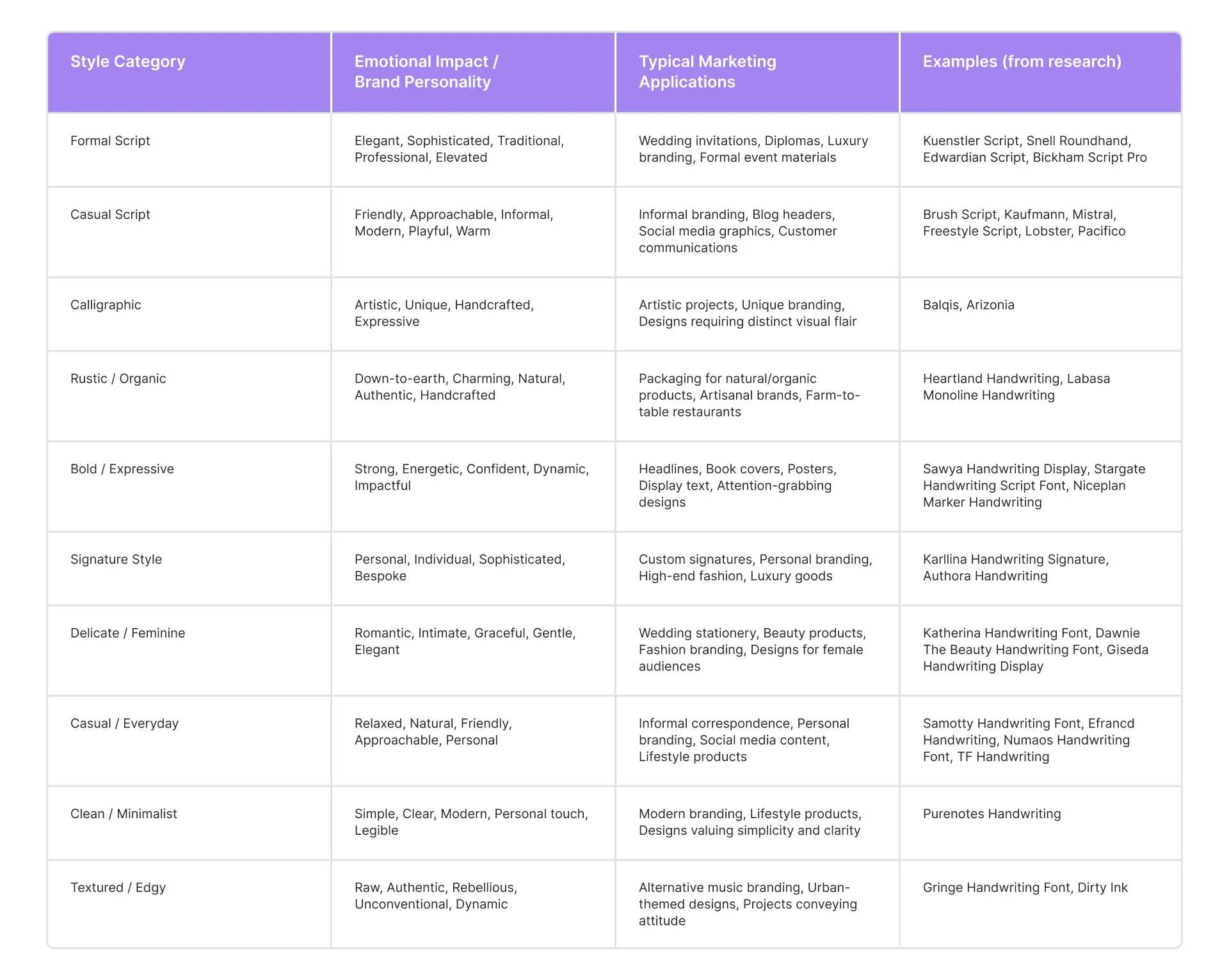
Script fonts are typically categorized into formal, casual, and calligraphic styles, each with unique attributes and ideal applications:
- Formal Scripts: These are often based on the letterforms of 17th- and 18th-century writing masters, characterized by uniform, predictable strokes that can vary in thickness, mimicking the precision of a quill or metal nib. They convey a formal, elegant, and traditional tone, often used to effect an elevated feeling.
- Applications: Formal scripts are perfect for event invitations, diplomas, luxury brand promotions, and professional settings where sophistication and gravitas are desired. Examples include Kuenstler Script, Snell Roundhand, Edwardian Script, and Bickham Script Pro.
- Casual Scripts: Displaying a less formal, more active hand, casual scripts often appear as if created by a wet brush rather than a pen nib. They communicate informality, approachability, and a modern sensibility.
- Applications: These fonts are well-suited for customer touchpoints designed to “break the ice” and foster connection. They are effective for informal branding, blog headers, and social media graphics. Notable examples include Brush Script, Kaufmann, Mistral, Freestyle Script, Lobster, and Pacifico.
- Calligraphic Script Fonts: This category specifically mimics calligraphic styles, distinguished by a visible variation in stroke widths that reflects the artistic “drawing of letterforms”. They possess a unique artistic flair.
- Applications: Calligraphic scripts are ideal for artistic projects and designs that require a distinctive, handcrafted feel, emphasizing uniqueness and creative expression.
Modern Interpretations and Styles
Beyond these primary categories, modern handwriting fonts offer a rich tapestry of diverse personalities, allowing for highly specific emotional and aesthetic expressions:
- Elegant & Personalized: Fonts like Authora Handwriting provide a refined and intimate feel, perfect for signature-style designs.
- Rustic & Down-to-Earth: Heartland Handwriting exudes a charming, natural character, suitable for brands seeking a grounded aesthetic.
- Modern & Minimalist: Aesthetik Handwriting Font and Labasa Monoline Handwriting feature clean lines and consistent weights, offering a contemporary handcrafted feel.
- Bold & Expressive: Sawya Handwriting Display and Stargate Handwriting Script Font utilize dramatic strokes and varying line weights to create a strong visual impact. They are ideal for headlines, book covers, and designs requiring immediate attention.
- Signature Style: Karllina Handwriting Signature closely emulates a personal signature, making it perfect for custom signatures and personal branding.
- Delicate & Feminine: Katherina Handwriting Font and Dawnie The Beauty Handwriting Font feature thin strokes and graceful curves, lending a romantic and intimate feel, often used for wedding stationery or beauty products.
- Casual & Everyday: Samotty Handwriting Font, Efrance Handwriting, and Numaos Handwriting Font offer relaxed, natural flows, suitable for informal branding and personal correspondence.
- Romantic & Elegant: Amoretti Handwriting Type exudes romance and sophistication, often chosen for wedding invitations or luxury branding.
- Clean & Minimalist: Purenotes Handwriting combines simple forms with consistency, maintaining a personal touch while valuing simplicity and clarity, suitable for modern branding and lifestyle products.
- Textured/Raw/Edgy: Gringe Handwriting Font and Dirty Ink mimic the appearance of real materials like marker, pen, or brush strokes. These fonts convey strength, energy, and confidence, embracing imperfections for a raw, authentic feel.
The extensive variety of handwriting fonts available reveals that “handwritten” is not a singular aesthetic but a broad spectrum of expressive possibilities. This ranges from highly refined formal scripts to rough, edgy, or playful casual styles. This diversity indicates that brands can select a handwritten font that precisely matches their specific nuance of authenticity, whether it is sophisticated bespoke, raw and rebellious, or friendly and casual. This shifts the strategic question from a simple “Should a handwritten font be used?” to a more nuanced “What kind of handwritten authenticity best embodies the brand’s unique personality and resonates most effectively with its target audience?” This refined approach allows for highly granular brand expression, moving beyond a binary choice to a sophisticated understanding of how to leverage the full range of “handmade” aesthetics.
Table 2: Handwriting Font Styles & Their Marketing Applications
5. Strategic Applications: Where Handwriting Fonts Shine in Branding
Handwriting fonts are not merely decorative elements; they are strategic assets that can significantly enhance a brand’s identity, fostering warmth, approachability, and a deeper connection with its audience.
Humanizing Brand Identity
These typefaces serve as powerful tools for communicating a brand’s core values and personality, particularly when the aim is to project warmth, hospitality, and a sense of nostalgia. They are instrumental in establishing a unique brand signature, making a brand instantly recognizable and distinctive. This is especially true for creative enterprises or businesses that emphasize a personal approach to their customers. The ability of handwritten fonts to signal a human presence behind the brand helps to cut through the impersonality often associated with large corporations, making the brand feel more relatable and less robotic. They are particularly effective in industries where emotional connection is paramount, such as food, fashion, and hospitality.
Key Marketing Applications
Handwriting fonts excel in various marketing contexts, contributing significantly to brand perception and engagement:
- Logos and Brand Marks: Handwritten fonts are an excellent choice for crafting custom, memorable logos that convey authenticity and a personal touch. Iconic examples, such as the flowing scripts of Coca-Cola and Kellogg’s, demonstrate their enduring power in establishing strong brand recognition. The unique, hand-drawn quality of these logos helps them stand out and become instantly recognizable symbols of their respective brands.
- Packaging Design: When applied to packaging, handwritten fonts impart a handcrafted feel, making products seem more relatable and “down to earth”. This is particularly effective for hedonic products like organic food, decorative candles, or artisanal gourmet items, where the font visually matches the product’s “natural” or unique identity. The aesthetic contributes to a perception of sincerity and quality.
- Social Media and Digital Content: In the digital realm, cursive and handwritten fonts can personalize content, making posts more visually appealing and emphasizing an informal communication style. This helps to bridge the gap between the brand and its audience, fostering a more intimate connection. They are well-suited for social media graphics, where a friendly and approachable tone is often desired.
- Personal Correspondence and Notes: The act of receiving a handwritten note signals genuine care and appreciation, which has been shown to boost future spending and strengthen brand loyalty. Handwritten-style fonts can effectively evoke this same sense of intimacy and personalization in digital communications, creating a memorable and impactful experience for the recipient.
- Headlines and Display Text: Bold, expressive handwriting fonts with dynamic strokes are exceptionally effective for headlines, book covers, and posters, where they can make a strong visual impact and immediately grab attention. These fonts can strategically highlight specific elements, titles, or important words, guiding the reader’s eye and emphasizing key messages.
- Invitations and Event Design: Formal and elegant script fonts are ideally suited for wedding invitations, greeting cards, and other event-related materials. Their sophisticated and charming aesthetic contributes to the overall mood and theme of the event, conveying a sense of occasion and refinement.
While traditional handwritten elements often imply bespoke, high-cost craftsmanship, the strategic application of handwritten fonts enables brands to project this “handmade” authenticity at a mass scale, across both digital and print mediums. This capability effectively bridges the gap between the consumer’s desire for personalization and the realities of modern marketing reach. Brands can thus achieve the emotional benefits of a personalized, handcrafted feel without the literal labor intensity or prohibitive costs of individual hand-drawing. This makes handwritten fonts a powerful tool for scaling authenticity, allowing even large corporations to feel intimate and approachable, provided they are used thoughtfully and consistently within their broader brand strategy.
6. Case Studies: Iconic Brands Leveraging Handwritten Fonts
Examining how established brands have successfully integrated handwriting fonts into their identity provides valuable lessons on their strategic impact.
Coca-Cola: The Epitome of Timeless Script
Coca-Cola’s logo is one of the most globally recognized brand marks, largely due to its distinctive typography.
- Font Choice: The iconic Coca-Cola logo features a flowing, cursive script style, specifically inspired by the Spencerian script, a popular handwriting style from the 19th century. This script was famously hand-drawn by Frank Mason Robinson, Coca-Cola’s bookkeeper at the time.
- Impact on Brand Identity:
- Tradition & Nostalgia: The elegant script exudes a sense of heritage, timelessness, and a classic feel, fostering familiarity and an association with enduring quality. It evokes a feeling of “the real thing”.
- Energy & Vitality: The fluid, connected letters are designed to reflect the product’s “fizzy, effervescent nature,” contributing to a dynamic brand perception.
- Strong Recognition: The unique curvature and style of the script make the logo instantly recognizable worldwide, even from a distance, contributing significantly to its global brand recognition.
- Authenticity & Approachability: The hand-drawn origin and cursive style convey a personal touch, making the brand feel friendly and authentic, as if it were a warm invitation.
- Longevity & Adaptability: Introduced in 1886, the Coca-Cola logo has remained virtually unchanged for over a century, with only subtle tweaks over the years to enhance legibility and adapt to digital platforms. This remarkable consistency underscores the simplicity and versatility of the design, allowing it to translate seamlessly across various mediums while maintaining its impact.
Coca-Cola’s logo, with its nearly unchanging Spencerian script, functions as a powerful visual anchor for the brand. This consistent visual element, rooted in a historical handwriting style, reinforces a sense of stability, reliability, and enduring quality over generations. The continuous presence of this familiar script builds deep brand recognition and fosters a profound sense of trust and nostalgia among consumers. This effect is not merely about recognition; it is about establishing an emotional connection through visual continuity, making the brand feel timeless and dependable in an ever-changing market.
Wendy’s: Modernizing with Approachability
Wendy’s 2013 logo redesign marked a significant shift in its brand identity, moving towards a more casual and approachable aesthetic.
- Evolution & Rationale: The previous Wendy’s logo, in use since 1982, featured an “Old West-style font” with curlicues. The 2013 redesign replaced this with a borderless white background and a “handwritten-script font” that the company described as “contemporary and iconic”. This change also saw the removal of the phrase “Old Fashioned Hamburgers,” allowing the brand to broaden its perception beyond just burgers to include salads, chicken, and other offerings. The shift aimed to align the brand with evolving consumer preferences, particularly among millennials and Gen Z, who gravitate towards authentic and playful designs.
- Impact on Brand Personality: The new font, with its playful curves and whimsical style, is designed to feel fun and light-hearted, as if “written by hand to close a personal note”. This choice deliberately reinforces Wendy’s brand personality as casual, approachable, and full of character. It personifies the brand’s values of warmth, hospitality, and nostalgia, presenting Wendy’s as a friendly, down-to-earth place for a good meal. The preservation of the “wave” in the name, combined with the casualness of the font, further conveys informality and friendliness.
Wendy’s font change represents a strategic refresh, demonstrating how a brand can evolve its visual identity to align with changing consumer expectations and broaden its product perception without losing its core essence. By adopting a more casual, handwritten script, Wendy’s strategically shed an outdated image to appeal to a new generation, repositioning itself as a modern yet still warm and hospitable fast-food option. This highlights the dynamic nature of brand identity and the critical role typography plays in communicating an evolving brand narrative and maintaining relevance in a competitive market.
Kellogg’s & Ford: Legacy Through Signature
Many successful brands have leveraged the power of a signature-style handwritten font to convey authenticity, quality, and a personal commitment, often linked to their founders.
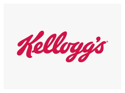
- Kellogg’s: The famous red Kellogg’s signature on cereal boxes originated over a century ago. William Keith Kellogg, the founder, would personally approve each box with his signature, a gesture that became synonymous with quality cereal. This direct link to the founder’s personal approval established a powerful association with high standards and quality that has persisted for over 100 years.

- Ford: The Ford logo, first developed in 1909, also has a unique handwritten origin. It came about because the company’s First Engineer, Childe Harold Wills, used calligraphy from business cards he enjoyed designing and printing. The iconic oval was added later, in 1912, and like Kellogg’s, the logo has enjoyed enormous longevity with minimal changes.
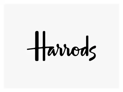
- Harrods: The Harrods logo, designed in 1967, was based on the signature of the store owner, Charles Harrods. This approach works particularly well when the brand and its owner are synonymous, as seen with high-end fashion designers like Paul Smith.

- Disney: Interestingly, the famous Disney logo, while appearing to be Walt Disney’s signature, was actually created about 20 years after his death. It bears little resemblance to Walt’s actual signature but closely resembles the signature used thousands of times by his employee, Hank Porter, who signed on Walt’s behalf to save him time. This demonstrates that even a proxy signature, when consistently applied, can create the desired “personal” and authentic feel.
These examples illustrate how brands leverage a founder’s (or a consistent proxy’s) signature to symbolize quality, authenticity, and personal commitment. The handwritten logo acts as a visual seal of approval, transferring the personal trust associated with an individual directly to a corporate entity. This strategy allows brands to evoke a sense of heritage and bespoke craftsmanship, even as they operate on a large scale. The “founder’s imprint” becomes a powerful trust signal, reinforcing the brand’s dedication to its origins and values, and fostering a deeper, more personal connection with consumers.
7. Challenges and Best Practices for Implementation
While handwriting fonts offer significant advantages in conveying authenticity and emotion, their effective implementation requires careful consideration of potential challenges related to readability, consistency, scalability, and technical performance.
Readability and Legibility Concerns
Handwriting fonts, particularly highly decorative or intricate script styles, can pose challenges to readability and legibility.
- Challenges: The interconnected letters and intricate strokes often hinder quick comprehension, especially in fast-paced reading scenarios like digital scrolling or high-speed signage. They tend to lack the clear structure of standard fonts, making them harder to read for long sections of text or even numerous headings. Furthermore, these fonts can render inconsistently across various screen sizes, leading to poor legibility and decreased accessibility, particularly for users with visual impairments or learning disabilities. Overly ornate fonts can also make a brand appear amateurish or outdated.
- Solutions: To mitigate these issues, handwritten fonts should generally be used sparingly and strategically. They are best reserved for headlines, titles, logos, or short phrases where they can make an impact without compromising clarity. When used for display, larger sizes can significantly improve readability. It is crucial to pair handwritten fonts with clean, simple sans-serif or serif fonts for body text and supporting content to ensure overall legibility and visual balance. Proper letter spacing (kerning and tracking) and line spacing (leading) are essential to prevent text from appearing crowded or difficult to decipher. Designers should avoid using handwritten fonts for formal documents, small text, or emergency information where clarity and precision are paramount. Testing the chosen font at various sizes and on different devices is critical to ensure legibility across all platforms.
Consistency and Scalability
Maintaining a consistent brand identity across diverse platforms and ensuring fonts scale appropriately are vital for strong brand recognition.
- Challenges: Hand-drawn typography, by its very nature, is unique to each creation, making consistent replication challenging, especially if design details change. This can lead to inconsistencies in visual representation across different materials. Furthermore, some handwritten fonts may not scale well across various screen sizes and resolutions, appearing cramped or pixelated on smaller mobile devices. A lack of versatility in a chosen font family (e.g., limited weights or styles) can also hinder consistent application across different design needs.
- Solutions: To ensure consistency and scalability, brands should opt for high-quality digital handwritten fonts that are designed for versatility and optimized for various applications. Establishing clear branding guidelines that dictate font usage, including specific font families, weights, and sizes for different elements, is crucial. It is generally recommended to limit the number of different typefaces used in a design to two or three complementary fonts to maintain visual coherence. Utilizing responsive design principles ensures that text scales appropriately across different devices and screen sizes. Choosing font families that offer multiple weights and styles provides flexibility while maintaining a unified visual identity.
Technical and Performance Considerations
The digital environment introduces specific technical considerations for font implementation, impacting website performance and user experience.
- Challenges: Fonts that rely on complex or custom styles, particularly some older cursive or script fonts, can increase page load times, negatively affecting user experience and search engine optimization (SEO). They may also introduce browser compatibility issues, rendering inconsistently or incorrectly across different web browsers. Furthermore, if not properly optimized for digital use, handwritten fonts can lead to accessibility violations, alienating users with disabilities and damaging brand inclusivity. Embedding fonts as images, rather than actual web fonts, can also lead to quality, accessibility, and search issues.
- Solutions: To address these technical challenges, brands should prioritize using web-optimized fonts, ideally those available through reputable services like Google Fonts or Adobe Fonts, which offer scalability, consistency, and CDN-based delivery for improved performance and SEO benefits. Ensuring proper licensing for commercial use is essential. Adherence to Web Content Accessibility Guidelines (WCAG) is paramount, focusing on readability and contrast to ensure inclusivity for all users. Thorough testing of font loading and rendering across various devices and browsers is critical to identify and resolve any technical problems before deployment.
The effective deployment of handwritten fonts necessitates a delicate balance between their inherent artistic and emotional appeal and their practical utility in various design contexts. This is not a matter of choosing between “art” and “functionality” but rather an imperative to integrate both aspects harmoniously. Successful implementation involves a holistic design approach, where the unique character and human touch of handwritten fonts are preserved while simultaneously mitigating their inherent challenges through strategic font pairing, thoughtful typographic hierarchy, and robust technical optimization. This ensures that the emotional impact is achieved without sacrificing readability, scalability, or performance.
8. Future Trends in Handwritten Typography
As the digital landscape continues to evolve, so too do typographic trends. Handwritten fonts are poised to maintain their relevance, adapting to new technologies and shifting consumer preferences.
Continued Emphasis on Authenticity
In an increasingly automated world, there is a growing desire for designs that feel authentic, relatable, and imbued with a human touch. This trend is a direct response to the rise of artificial intelligence in design, where precision can sometimes overshadow warmth. Handwritten fonts are critical to this movement, as they inherently provide that personal connection and warmth, capturing audience attention in a way that perfectly polished, machine-generated fonts may not. This is particularly appealing to younger generations, such as Gen Z and Millennials, who gravitate towards designs that feel genuine and playful.
Modern Cursive Scripts
The future of handwritten typography will see a continued evolution of cursive scripts. Two distinct sub-trends are emerging:
- Vintage Scripts: These styles are reminiscent of delicate calligraphy, evoking a sense of timeless elegance and sophistication. They draw inspiration from historical penmanship, often with subtle irregularities that enhance their authentic feel.
- Contemporary Scripts: Characterized by bold, free-flowing forms with dynamic baselines and varying letter sizes, these scripts convey strength, energy, and confidence. They offer a modern twist on the handwritten aesthetic, suitable for impactful display purposes.
Textured and Raw Styles
A significant trend involves handwritten fonts that mimic the look of real materials, such as marker, pen, pencil, or brush strokes. These textured fonts embrace imperfections and a raw, edgy feel, conveying a sense of dynamism and authenticity. The move away from perfectly polished fonts towards more expressive and distinctive typography is gaining traction, reflecting a desire for designs that feel more “crafted by hand”.
Strategic Pairing
The practice of strategically pairing handwritten fonts with other typeface categories will continue to be a best practice. Handwritten styles are rarely used in isolation for extensive text; instead, they serve as complements to serif and sans-serif fonts to achieve a balanced and cohesive visual identity. This approach allows brands to leverage the emotional impact of handwritten fonts for emphasis (e.g., in headlines or logos) while ensuring readability and clarity for body text through more traditional typefaces.
Technological Advancements
Technology will play an increasingly vital role in the creation and optimization of handwritten typefaces. Advances in digital pens and tablets are making the process of creating hand-drawn types more cost and time-efficient for designers. Furthermore, the development of variable fonts, which allow designers to adjust weight and style dynamically, will offer unprecedented flexibility and efficiency in applying handwritten aesthetics across various platforms and scales. Artificial intelligence may also contribute to generating and refining handwritten styles, though the emphasis will likely remain on preserving the authentic, human touch amidst AI’s precision.
The future of typography, particularly concerning handwritten fonts, points towards a broader movement to reintroduce human elements into increasingly automated digital design processes. This represents a counter-trend to the pursuit of AI-generated perfection, acknowledging a fundamental human craving for connection and authenticity. Brands that successfully integrate handwritten fonts will likely position themselves at the forefront of this “rehumanization” movement, fostering deeper emotional resonance and stronger brand loyalty in a technologically advanced landscape. This strategic choice will enable them to stand out by providing a tangible sense of warmth and individuality in a crowded digital space.
Jordie’s Creative Agency: Your Partner in Building Brands That Connect
At Jordie’s Creative Agency, we pride ourselves on being more than just a service provider; we are dedicated partners in navigating the complexities of modern branding and marketing. We work hand-in-hand with our clients to bring their vision to life, ensuring every solution is meticulously tailored to their unique needs and goals. We are committed to delivering results that truly matter, employing clear, jargon-free communication and fostering a collaborative spirit. We believe in building relationships as strong as the brands we meticulously create.
Our core services include:
- Brand Positioning & Logo Design: We help define a unique identity, craft a compelling brand story, and design memorable logos that resonate with the target audience, often leveraging the power of custom typography, including handwriting fonts, for maximum impact.
- Website Design & Development: We build intuitive, engaging, and visually stunning websites that function not merely as online brochures but as powerful conversion machines, ensuring a brand’s personality shines through every pixel.
- UI/UX Design: We focus on creating seamless and delightful user experiences, ensuring digital platforms are not only aesthetically pleasing but also incredibly easy and enjoyable to navigate.
- Social Media Marketing: We craft dynamic social media strategies that build community, drive engagement, and amplify a brand’s voice across all relevant platforms, integrating compelling visual and textual content.
- Content Marketing: We develop compelling content strategies, from insightful blog posts like this one to engaging videos, that educate, entertain, and convert an audience, positioning clients as industry leaders.
- Search Engine Optimization (SEO): We optimize online presence to ensure a brand is easily discoverable by its target audience, driving organic traffic and maximizing visibility in search results.
- Pay-Per-Click (PPC) Services: We design and manage highly effective PPC campaigns that deliver immediate, measurable results, strategically placing a brand directly in front of potential customers precisely when they are ready to make a purchase.
- Video Marketing: We produce captivating video content that tells a brand’s story, showcases products effectively, and connects with an audience on a deeper, more emotional level.
By explicitly linking the benefits of handwriting fonts (e.g., engagement, recall, authenticity) to specific services like Brand Positioning & Logo Design, Social Media Marketing, and Content Marketing, we create a direct value proposition for Jordie’s Creative Agency. This is not merely a list of services; it is a demonstration of how our services directly address the very needs highlighted by the discussion on typography. For example, if handwriting fonts boost social media engagement, then our Social Media Marketing service is perfectly positioned to leverage this. If custom handwritten logos increase brand recall, then our Brand Positioning & Logo Design service provides the ideal solution. This section transforms theoretical benefits into actionable solutions provided by Jordie’s Creative Agency, making the agency the natural choice for businesses seeking to implement these strategies effectively. It demonstrates our comprehensive capability to deliver on the promise of a humanized and connected brand.
9. Conclusions and Recommendations
Handwriting fonts are powerful assets in a brand’s typographic toolkit, offering a unique capacity to forge emotional connections and convey authenticity in an increasingly digital world. The analysis reveals that their impact extends beyond mere aesthetics, influencing consumer attitudes and purchase intentions through perceived congruence and sincerity. This “humanization dividend” is particularly potent for hedonic products, where emotional attachment is a key driver of consumer behavior.
The historical journey of typography underscores that the desire for a “human touch” is deeply ingrained in the evolution of written communication, making the modern resurgence of handwritten fonts a natural progression, democratized by technological advancements. The diverse array of handwritten styles available today allows for a highly nuanced expression of authenticity, enabling brands to select a font that precisely embodies their unique personality, from formal elegance to raw edginess.
Successful implementation, however, requires a careful balance between the artistic appeal of handwritten fonts and their practical utility. Readability, scalability, consistency, and technical performance are critical considerations. Challenges such as legibility issues, inconsistent rendering across devices, and potential performance impacts must be addressed through strategic font pairing, thoughtful typographic hierarchy, and adherence to best practices in web and print design.
Recommendations for Brands:
- Align with Product Nature: For hedonic or experience-driven products, prioritize handwritten fonts to foster emotional attachment and humanize the brand. For functional or utilitarian products, machine-written fonts are generally more appropriate to convey professionalism and reliability.
- Define Your “Authenticity”: Do not simply choose “a” handwritten font. Instead, identify the specific nuance of authenticity your brand embodies (e.g., sophisticated, playful, rustic, rebellious) and select a handwritten style that precisely reflects that personality.
- Strategic Application and Pairing: Use handwritten fonts judiciously for high-impact elements like logos, headlines, packaging, and personal correspondence. Always pair them with highly legible serif or sans-serif fonts for body text and extensive content to ensure overall readability and visual balance.
- Prioritize Technical Performance and Accessibility: Opt for high-quality, web-optimized handwritten fonts from reputable sources. Ensure they render consistently across various devices and browsers. Adhere to accessibility guidelines (WCAG) to make your brand inclusive for all users.
- Embrace the Future: Stay abreast of technological advancements in typography, such as variable fonts and AI-assisted design tools, to leverage new possibilities for integrating handwritten aesthetics efficiently. This positions your brand at the forefront of the “rehumanization” trend in digital design.
By adopting a holistic approach to typography, where handwritten fonts are thoughtfully integrated within a broader brand identity system, businesses can cultivate deeper emotional connections with their audience, strengthen market presence, and differentiate themselves in a crowded marketplace.
Start your branding journey with us today, let’s build the future of your brand, together. Contact us today!