Turning everyday spaces into stories worth living in
Weaves & More was built on a belief that feels instinctive; a home is more than what you place in it, it’s how it makes you feel. Rooted in home textiles and interior living, the brand brings together traditional weaving inspiration with a modern, thoughtful design sensibility.
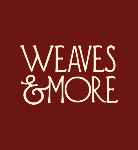
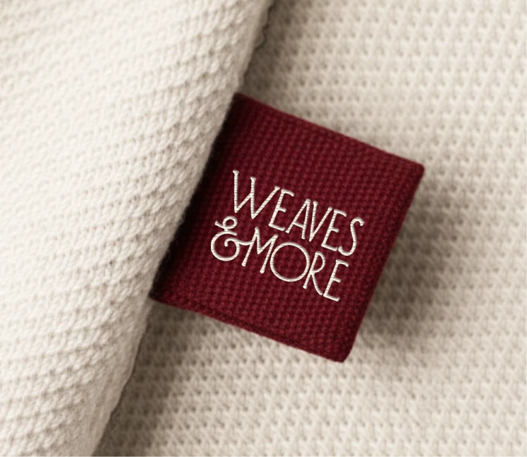
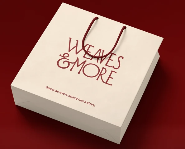
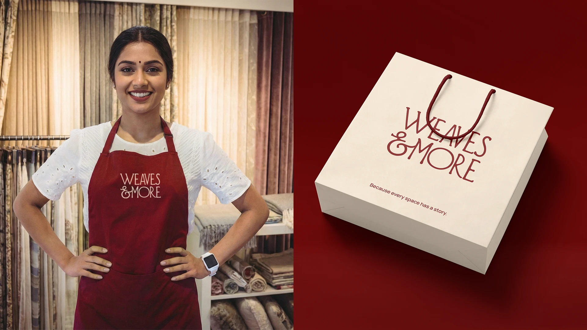
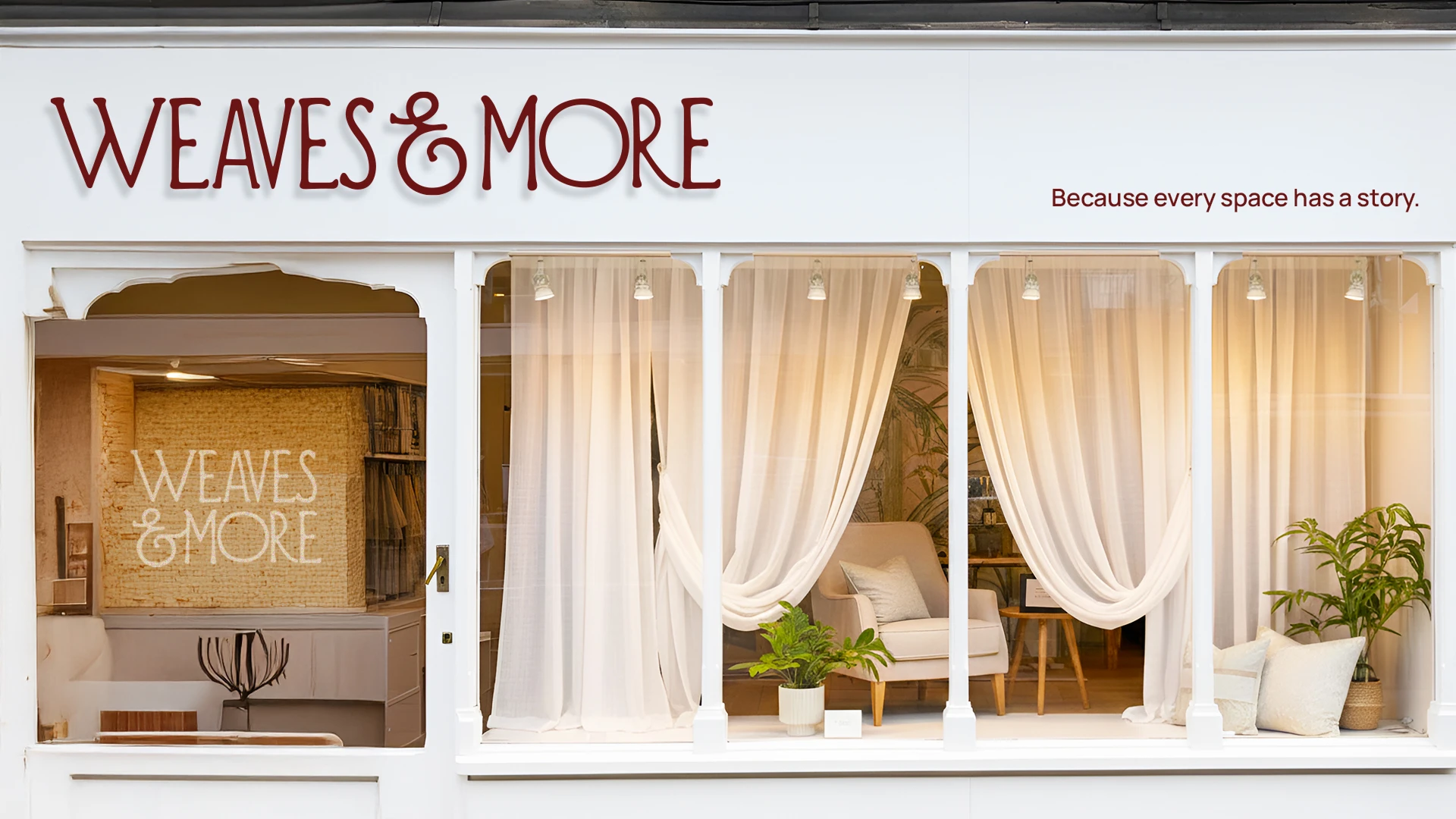
Our role was to shape the brand from the ground up, defining its strategy, identity, and visual language into a system that feels warm, expressive, and quietly refined. From the logo to the broader design system, every element was built to reflect comfort, craftsmanship, and the emotional connection people share with their spaces. The tagline, “Because every space has a story,” became the anchor that ties it all together.
THE CHALLENGE
Creating a brand that feels as personal as the spaces it lives in
The home textile category is visually rich, but often lacks a deeper narrative that people can connect with.
Most brands focus on product aesthetics alone, missing the emotional layer that turns a house into a lived-in space.
Weaves & More wanted to go beyond selling textiles and instead build a brand that celebrates the stories, routines, and moments that unfold at home.
The identity needed to strike a careful balance; rooted in traditional craftsmanship, yet relevant to modern interiors.
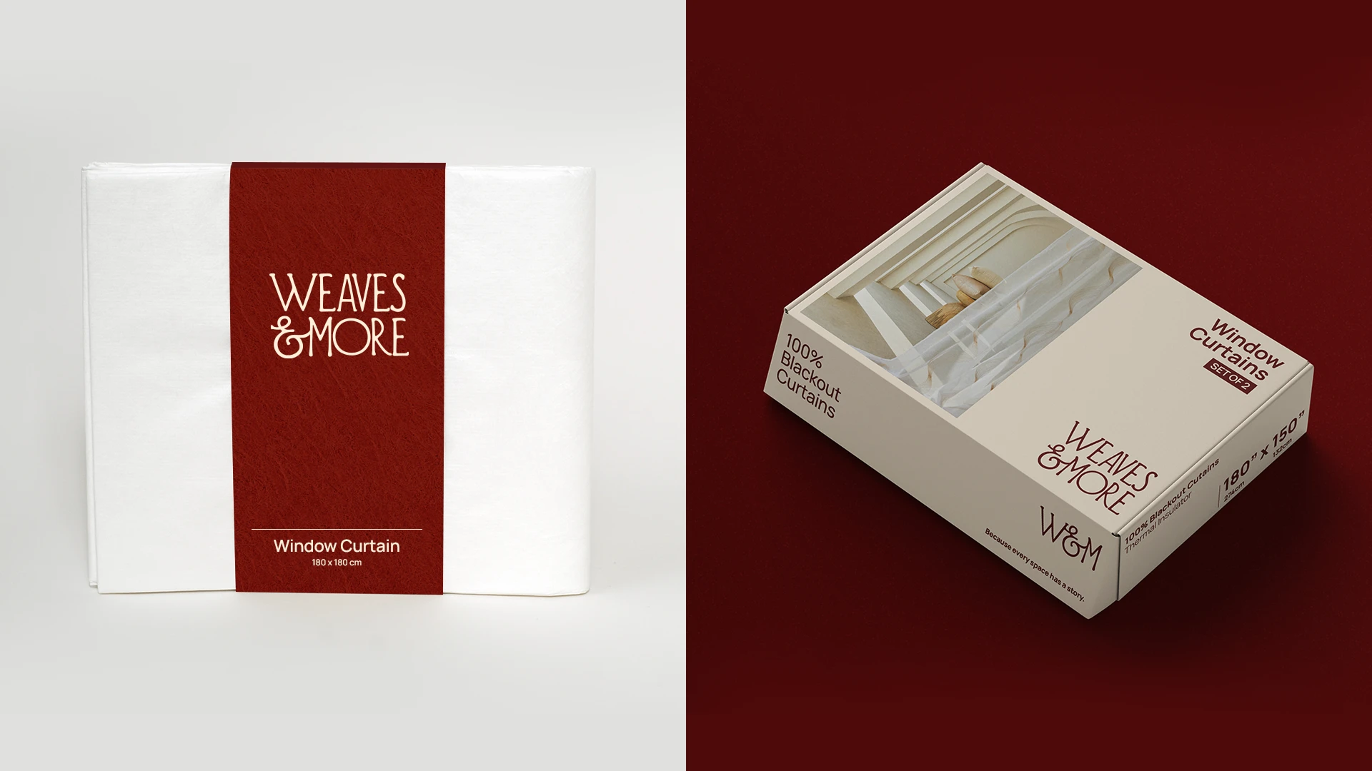
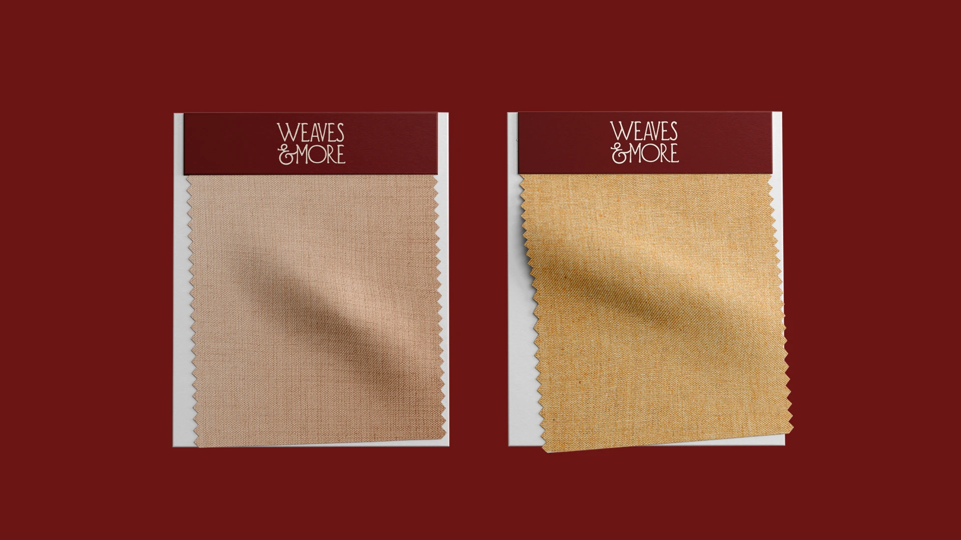
It also had to be versatile, working seamlessly across packaging, digital platforms, retail environments, and marketing touchpoints.
Above all, the brand needed to feel warm and human; expressive without being overwhelming, and refined without feeling distant.
How we solved
Designed to feel warm, expressive, and quietly distinctive
We started by defining the brand’s core philosophy around storytelling, comfort, and the emotional value of everyday living spaces.
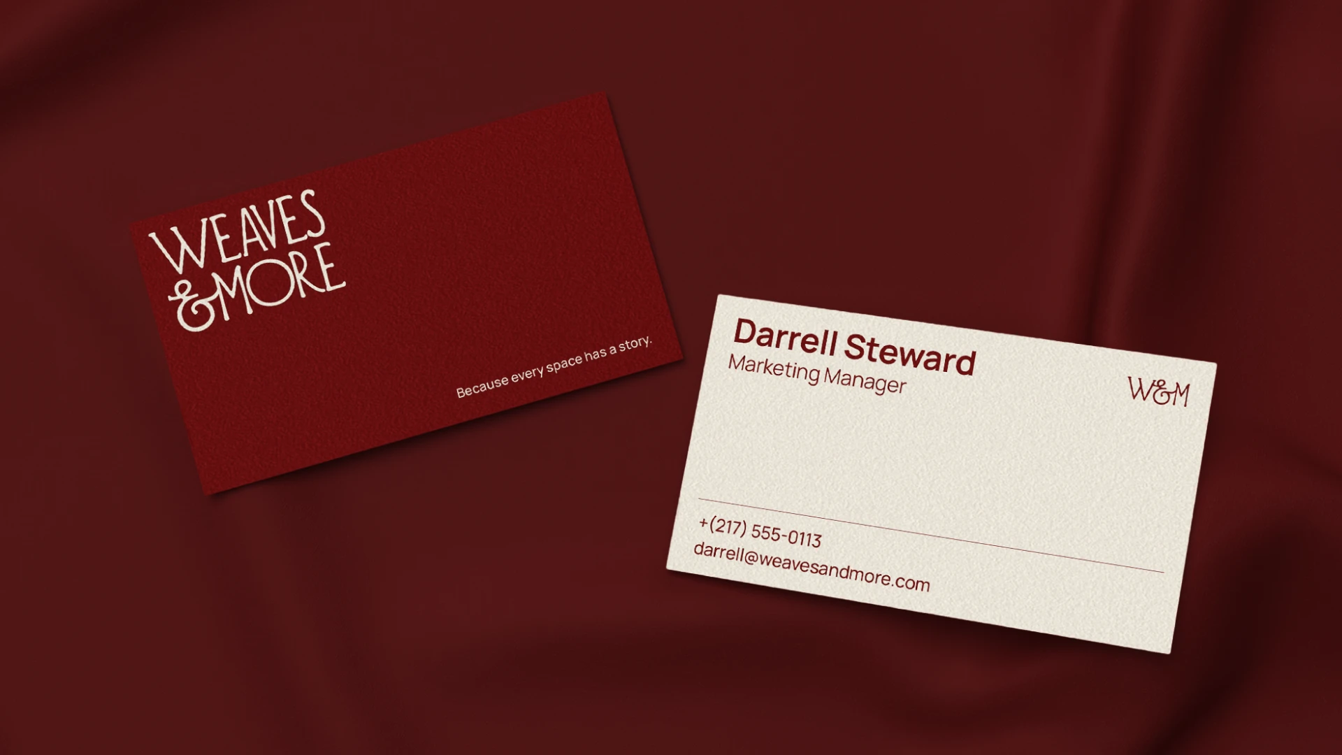
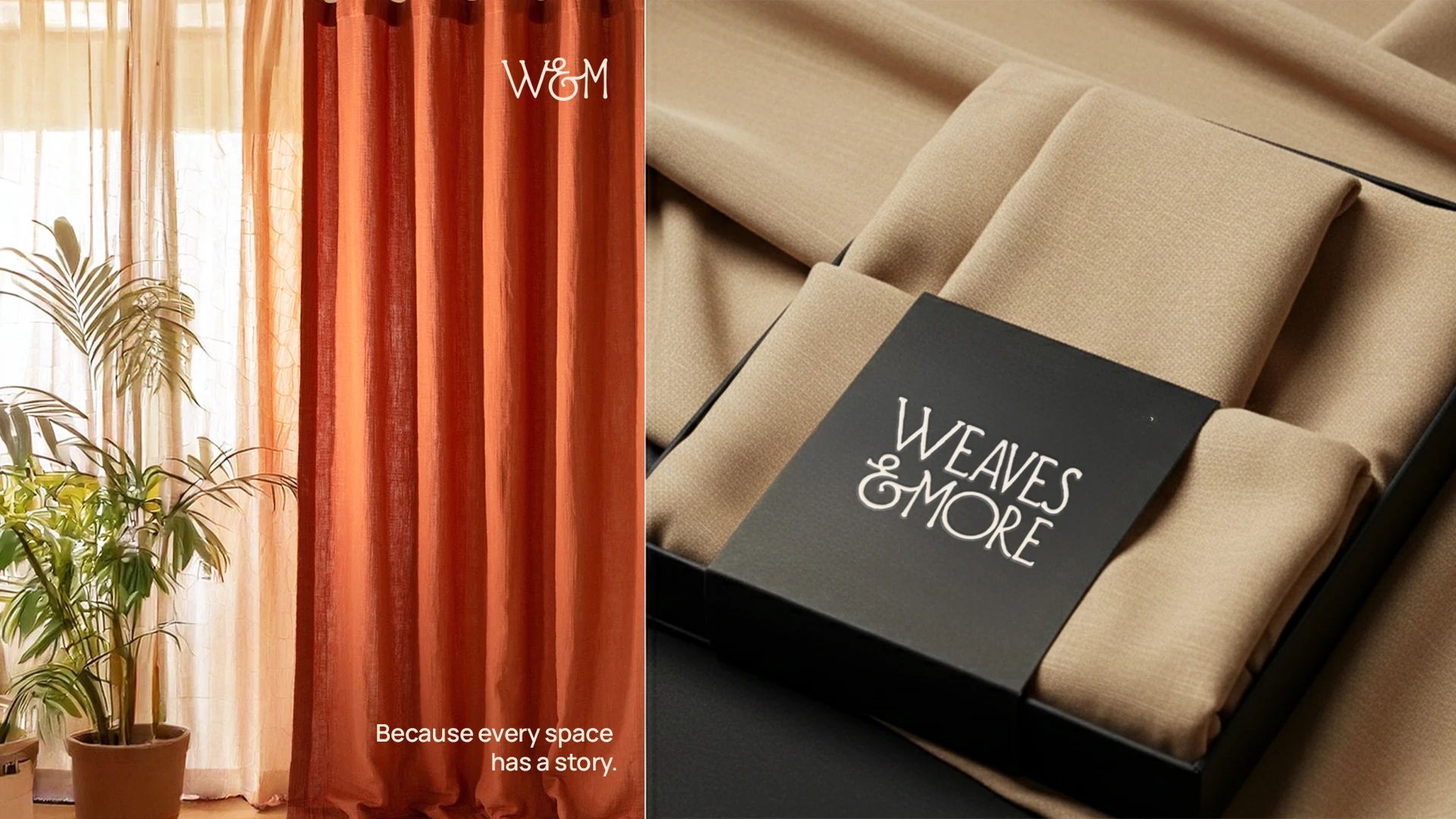
The tagline “Because every space has a story” was developed as the brand’s central idea, grounding every expression in meaning, not just aesthetics.
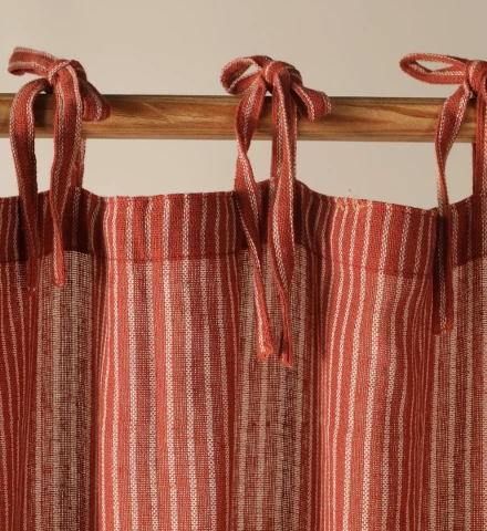
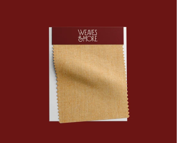
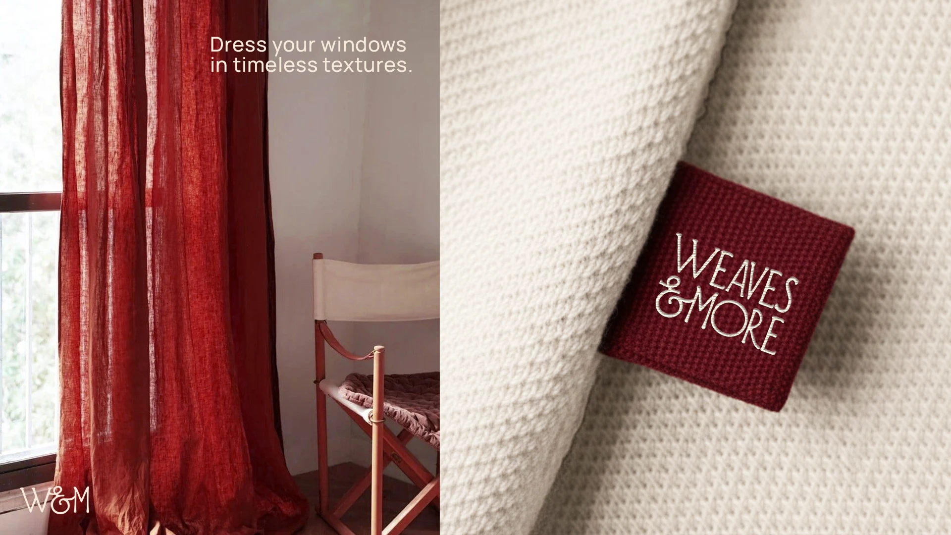
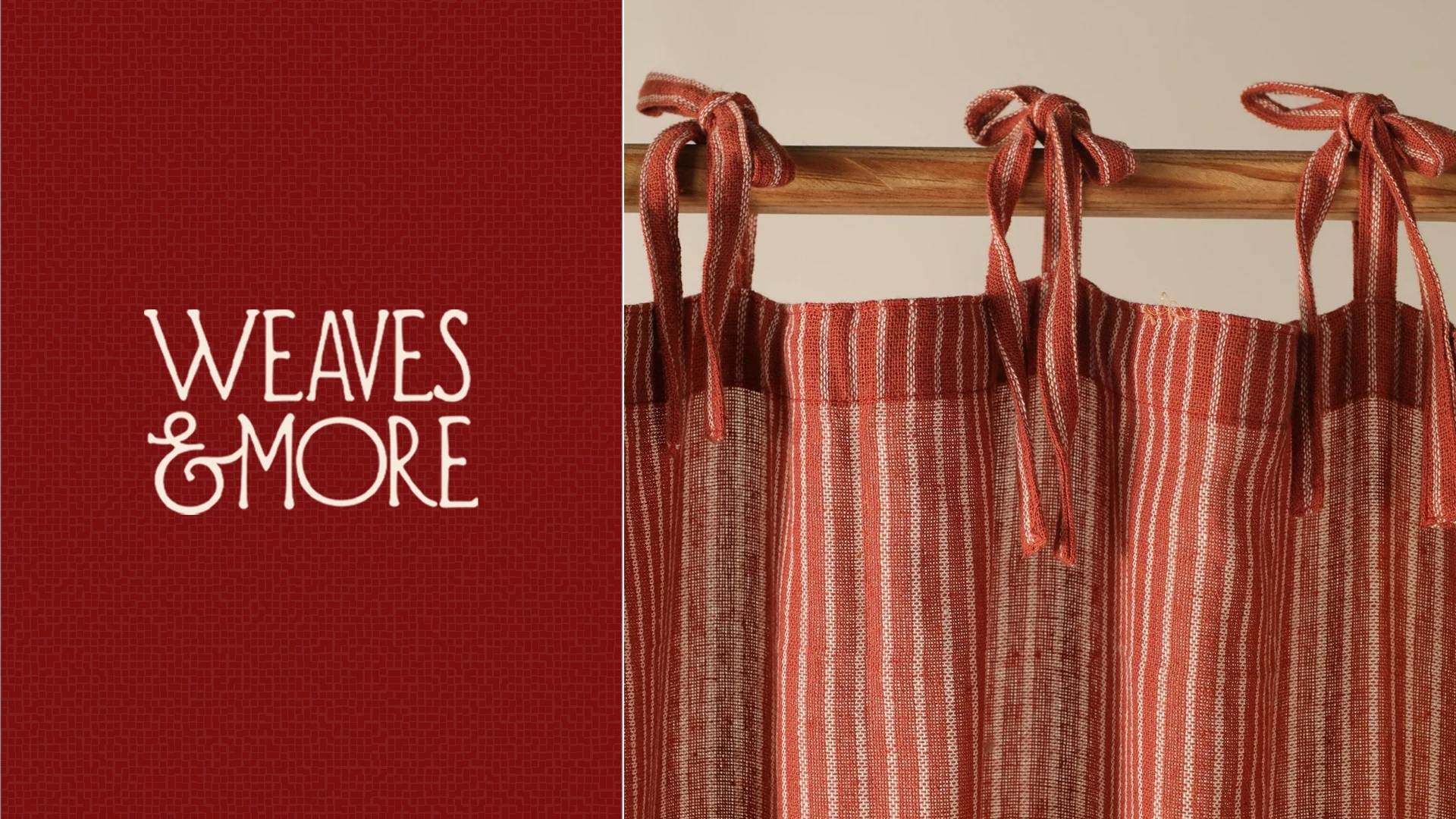
The visual identity was crafted using soft, organic forms and handcrafted curves, subtly inspired by weaving traditions while maintaining a contemporary edge.
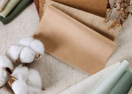
A palette of warm, grounded tones was introduced to reflect familiarity, comfort, and a sense of belonging within interior spaces.
Typography was carefully paired; Cormorant Garamond brings character and elegance, while Inter ensures clarity and usability across applications.
We built a flexible visual system that adapts seamlessly across packaging, digital, and physical environments without losing consistency.
Comprehensive brand guidelines were developed to protect and scale the identity as the brand grows into a broader lifestyle space.
THE Result
A brand that brings warmth, meaning, and identity into everyday living
Weaves & More now stands as a story-driven lifestyle brand that goes beyond product to create an emotional connection.
Its identity reflects comfort, authenticity, and a deep understanding of what home represents to people.
The visual system feels distinctive yet calm, allowing the brand to stand out without overpowering the spaces it belongs to.
With a strong strategic foundation in place, the brand is built to expand while maintaining clarity, consistency, and character.
More than anything, Weaves & More turns everyday spaces into something personal; lived in, felt, and remembered.
Trishal Says..
Their understanding of our vision, market positioning, and long-term brand goals was truly impressive. The quality of the deliverables exceeded our expectations.
Trishal Brar
Owner — Aditi Agro Frozen Foods
NEXT PROJECT • NEXT PROJECT • NEXT PROJECT •NEXT PROJECT • NEXT PROJECT • NEXT PROJECT •NEXT PROJECT • NEXT PROJECT • NEXT PROJECT •
NEXT PROJECT • NEXT PROJECT • NEXT PROJECT •NEXT PROJECT • NEXT PROJECT • NEXT PROJECT •NEXT PROJECT • NEXT PROJECT • NEXT PROJECT •
PAWNDERR
NEXT PROJECT • NEXT PROJECT • NEXT PROJECT •NEXT PROJECT • NEXT PROJECT • NEXT PROJECT •NEXT PROJECT • NEXT PROJECT • NEXT PROJECT •
NEXT PROJECT • NEXT PROJECT • NEXT PROJECT •NEXT PROJECT • NEXT PROJECT • NEXT PROJECT •NEXT PROJECT • NEXT PROJECT • NEXT PROJECT •